


Frontend Developer Manual / Version 2506.0
Table Of ContentsThere are various ways container layouts can be rendered. This section will describe the approach CoreMedia is using in the example banner bricks and themes. For this, you should have understood the basic concepts of view dispatching (see the Content Application Developer Manual for more details).
Definition
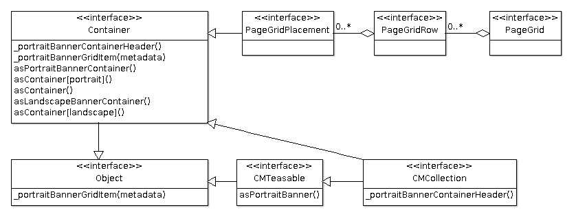
In CoreMedia's bricks and themes a container layout is a visual component that consists of a header and a grid. It is based
on the model com.coremedia.blueprint.common.layout.Container. The header of a container layout can
contain additional information like a teaserTitle or teaserText if the information is provided. The grid will
arrange the items found in the model specifically based on the type of the container layout.
Typical beans implementing the interface com.coremedia.blueprint.common.layout.Container are
com.coremedia.blueprint.common.layout.PageGridPlacement and com.coremedia.blueprint.common.contentbeans.CMCollection.
Their viewtype property (also referred to as Layout Variant in Studio) determines
which type of container layout will be used.
Involved Models and Views
The following class diagram gives an overview about the different models and views that are involved in the
rendering of container layouts and their relation to each other. Every method in the corresponding model stands for
a Freemarker template, for example, the asPortraitBanner method of the model CMTeasable stands for
CMTeasable.asPortraitBanner.ftl.

Note
The package names of the corresponding models are omitted.
Although the interface Object does not exist in Java, CoreMedia decided to keep the diagram simple by
introducing it instead of adding actual implementation classes which can inherit from
java.lang.Object. The goal is to also visualize the fallback view.
Of course much more views do exist for the corresponding models in the Frontend Workspace. Here, only the views are shown that are covered by this section.
asPortraitBanner
Renders the given bean as a portrait banner (see Section 6.4.14, “Example Portrait Banner”).
asPortraitContainer
This view is used to render the outer HTML structure of the portrait container layout. It will utilize
the partial views _portraitBannerContainerHeader and _portraitBannerGridItem.
_portraitBannerContainerHeader
Renders the header part of the portrait banner container based on the given bean. While a PageGridPlacement
will not add any information for CMCollection the content of the teaserTitle is rendered.
_portraitBannerGridItem
Renders the given bean by including the view asPortraitBanner and wrapping it into an HTML structure
that is needed to render it as a grid item.
The portrait banner grid does not support nested container layouts so whenever a
com.coremedia.blueprint.common.layout.Container is encountered its items will be rendered as if they
are part of the outer portrait banner container.
asContainer[portrait]
This view is just used for dispatching the viewtype with the id portrait to the view
asPortraitContainer.
asContainer
This view is included if the viewtype property is not set or there is no view asContainer[id]
handling the selected viewtype id. So it acts as the default and also as a fallback.
As the definition of default might differ from one theme to another it is not contained in any banner brick but is located in CoreMedia's themes.
Using Container Layouts for the PageGrid
Let's see the container layouts in action. You will see the flexibility of the container layouts by using them in
a PageGrid. You will be able to explicitly set the viewtype for a PageGridPlacement
to render all its items in the portrait banner container layout or you can keep the default viewtype
for the PageGridPlacement and add CMCollections which set the viewtype.
To have more variety, the landscape banner brick (see Section 6.4.10, “Example Landscape Banner”) will
also be used.
Note
The example will not cover how to render beans not implementing the com.coremedia.blueprint.common.layout.Container
interface inside a PageGridPlacement or CMCollection if no layout is picked. You can see
one possible solution in CoreMedia's example themes (shared-example-theme, for instance).
The approach will render non-container items as left-right banners that do not require a surrounding
container layout to work. This also allows mixing container and non-container items in a single PageGridPlacement
or CMCollection.
Preparation
If you want to replay the example you need to do the following things in the Frontend Workspace:
Create a new theme and add the bricks
@coremedia/brick-page,@coremedia-examples/brick-portrait-bannerand@coremedia-examples/brick-landscape-banner(see Section 5.1, “Creating a New Theme”).Create a template
src/templates/com.coremedia.blueprint.common.layout/Container.asContainer.ftlwith the following content:<#-- @ftlvariable name="self" type="com.coremedia.blueprint.common.layout.Container" --> <#list self.items![] as item> <@cm.include self=item view="asContainer" /> </#list>
Example 5.6. Container.asContainer.ftl
Create a template
src/templates/com.coremedia.blueprint.common.layout/PageGridPlacement.ftlwith the following content:<#-- @ftlvariable name="self" type="com.coremedia.blueprint.common.layout.PageGridPlacement" --> <div id="cm-placement-${self.name!""}" class="cm-placement"<@preview.metadata data=[bp.getPlacementPropertyName(self), bp.getPlacementHighlightingMetaData(self)!""]/>> <@cm.include self=self view="asContainer" /> </div>Example 5.7. PageGridPlacement.ftl
(optional) To make images work you need to add responsive-image settings
src/settings/Responsive Images.settings.jsonwhich could look like this to enable the crops used by the banner types:{ "enableRetinaImages": false, "responsiveImageSettings": { "portrait_ratio1x1": { "widthRatio": 1, "heightRatio": 1, "0": { "width": 300, "height": 300 } }, "portrait_ratio2x3": { "widthRatio": 2, "heightRatio": 3, "0": { "width": 300, "height": 450 } }, "landscape_ratio16x9": { "widthRatio": 16, "heightRatio": 9, "0": { "width": 480, "height": 270 } } } }Example 5.8. Responsive Images.settings.json
(optional) To adjust the MIME type / file extension of links to image variants add a property
linkMimeTypeMappingfor example next toresponsiveImageSettingsin the example above. The property configures a mapping of original image MIME type to the MIME type that should be used when building links to the variants. The respective JSON to map for exampleimage/jpegtoimage/pngcould look like this:{ "linkMimeTypeMapping": { "image/jpeg": "image/png" }, "responsiveImageSettings": {...} ... }For details see Section 5.4.14, “Images” in Blueprint Developer Manual .
(optional) To have property responsive styling edit
src/sass/_variables.scss:// Own variables first $cm-screen-sm-min: 800px; $cm-screen-lg-min: 1200px; $breakpoints: ( "xs": "screen and (max-width: #{$cm-screen-sm-min - 1})", "xs-and-up": "screen and (min-width: 0)", "sm": "screen and (min-width: #{$cm-screen-sm-min}) and (max-width: #{$cm-screen-lg-min - 1})", "sm-and-up": "screen and (min-width: #{$cm-screen-sm-min})", "lg": "screen and (min-width: #{$cm-screen-lg-min})", "lg-and-up": "screen and (min-width: #{$cm-screen-lg-min})", "pt": "print" ) !default; // Dependency variables @import "?smart-import-variables";Example 5.9. _variables.scss
Deploy the theme (see Section 5.6, “Importing Themes into the Repository”).
On the content side make sure that you prepare the following content in the CoreMedia Studio:
Create a new page and use the newly uploaded theme
Configure a page grid with 2 placements, e.g.
placement1andplacement2(see Section 4.5.1.1, “Editing a Page Grid” in Studio User Manual)Create two layout Variants for
CMChannelbelowOptions/Viewtypesand make sure to set theLayoutfield toportraitandlandscaperespectively (see Section 4.5.1.2, “Adding a Layout Variant” in Studio User Manual)Assign the layout variant
portraittoplacement1and add some articles.Assign no layout variant (Default) to
placement2and add two collections:collection1andcollection2.Assign the layout variant
landscapetocollection1and add some articlesAssign the layout variant
portraittocollection2and add some articles
Result
You should now see three container layouts: The first layout represents placement1. It has no header
and all items are displayed as portrait teasers. The second and third layout represent the content of placement2.
If the teaser title of collection1 and collection2 is set it will be rendered in the
header. The items of the corresponding collections are rendered as defined by their layout variant (landscape and portrait).
The following sequence diagrams demonstrates how each view is involved in the rendering of the page grid:
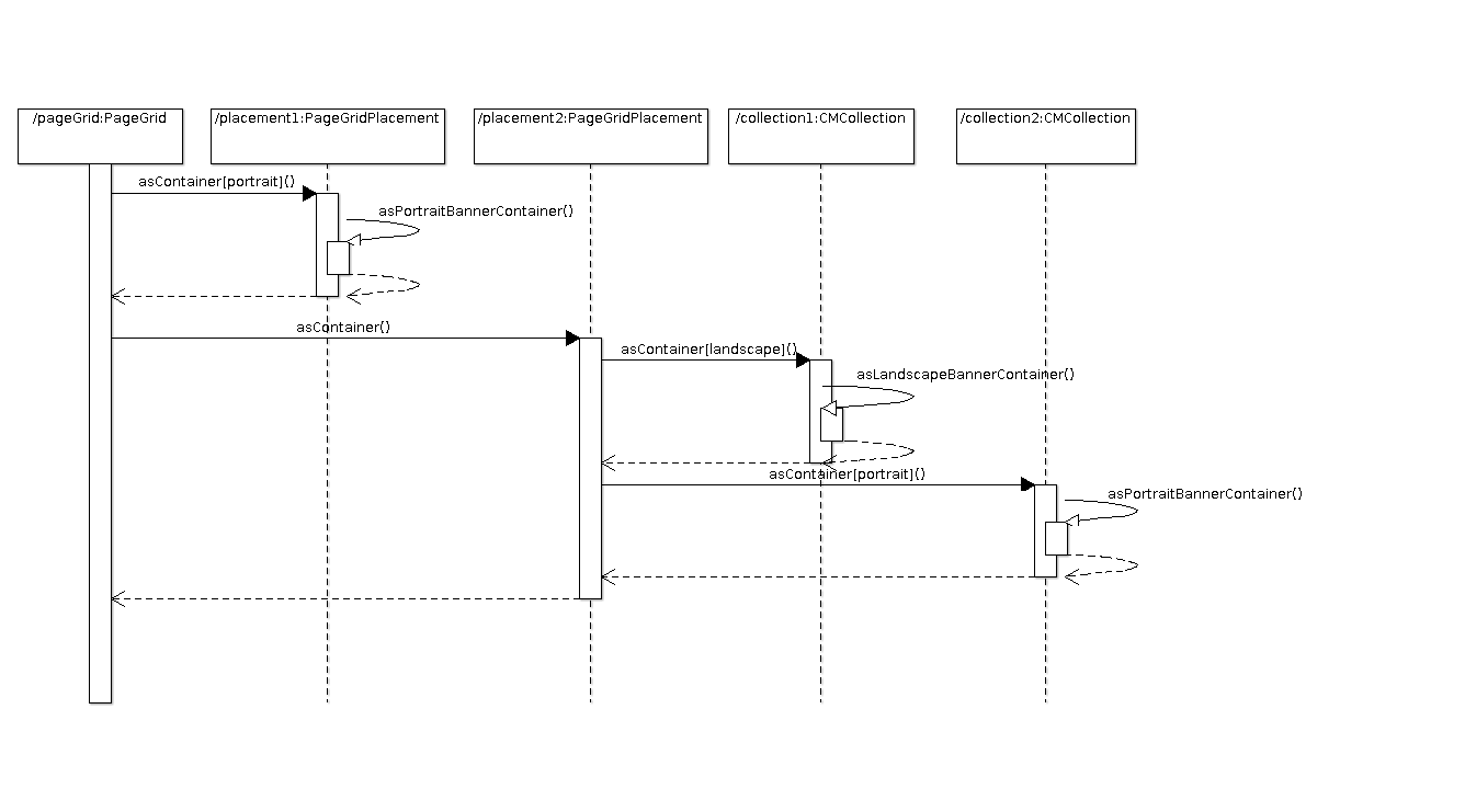
Note
In order to keep the diagram readable the sequence stops at asPortraitBannerContainer. This will be
covered by the next section.
Nested Collections
CoreMedia's container layouts can also handle nested collections. Let's assume instead of having multiple articles in
placement1 (see previous section) you have a single article article1 and a collection
nestedCollection. The later also contains an article nestedArticle.
The following sequence diagram shows how the rendering works in this case. The starting point is where
the view asPortraitBannerContainer is included:
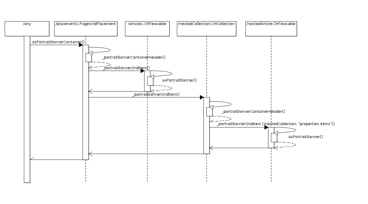
As you can see the inclusion of _portraitBannerGridItem in placement1 leads to another
inclusion of _portraitBannerGridItem which also passes the metadata data of nestedCollection and
its items property. This is important for the preview based editing as otherwise the hierarchical
information about how the nestedArticle comes into the rendering (which is placement1 ->
items -> nestedCollection -> items) is incomplete.
