Metrics Tab Table
Example explaining the metrics and the table displayed in the metrics tab.
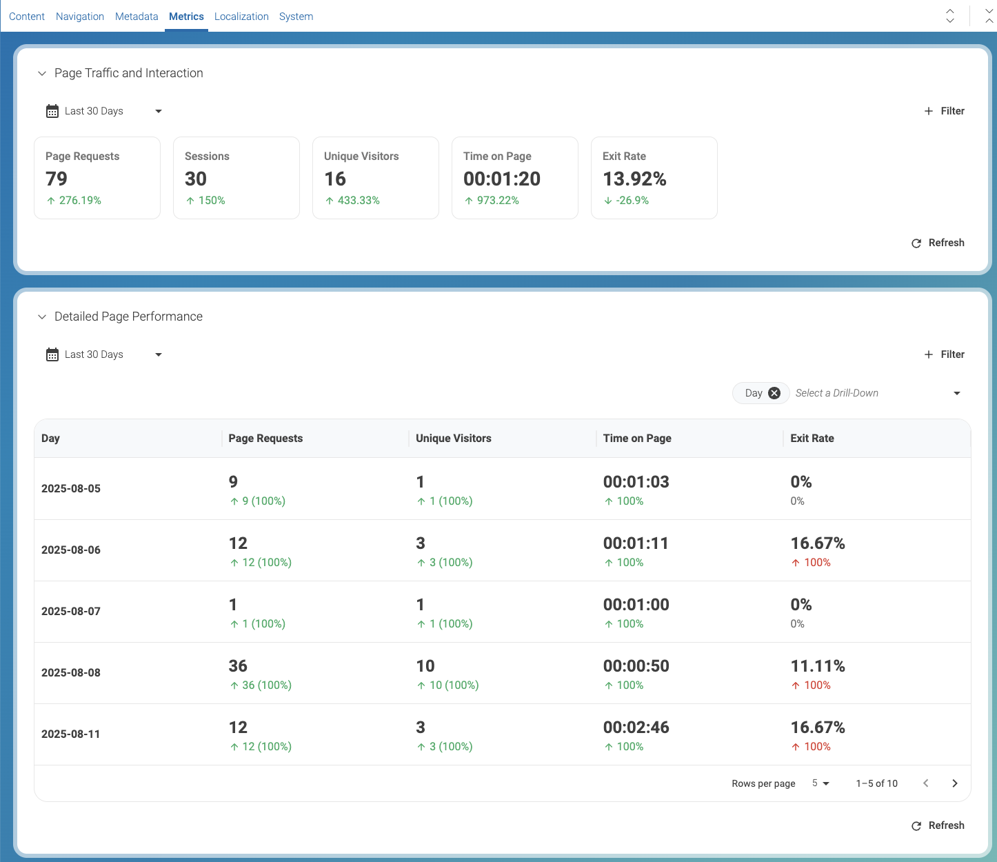
The data in the image refers to a period of 30 days. The percentages in green or red next to the values, indicate the increase or decrease of the metric relative to the previous 30 days.
For example, Page Requests in the 2025-08-06 had a increase of 100% relative to 2025-07-06.
Page Traffic and Interaction
-
Page requests: 79 (+276%) The page was opened 79 times—nearly four times more than before.
-
Sessions: 30 (+150%) Visitors engaged in 30 browsing sessions, a strong increase in activity.
-
Unique visitors: 16 (+433%) The number of different people who came to the page more than quadrupled, showing that reach expanded significantly.
-
Time on page: 1 min 20 sec (+973%) People are spending almost 10 times longer on the page than before—clear evidence that the content is attracting attention and holding it.
-
Exit rate: 13.9% (-27%) Fewer people are leaving the site after viewing this page. This suggests the page is encouraging visitors to continue exploring instead of dropping off.
Business takeaway: The page is not only drawing many more visitors, but those visitors are also spending more time and are less likely to leave the site afterwards. This points to a clear improvement in both visibility and quality of engagement.
Detailed Page Performance
This table shows how visitors are interacting with a specific page over several days. Each line of the table shows metrics for the day shown in the first column. You can change the grouping of the data. For example, you can change the first column of the table to group data by month.
-
Page requests: How many times the page was opened.
-
Unique visitors: How many different people actually visited (since the same person could open it multiple times).
-
Time on page: The average time people spent reading.
-
Exit rate: The percentage of people who left the website after visiting this page.
What the numbers are telling us
-
Traffic volume:
-
The page had relatively low traffic overall (between 1 and 36 requests per day).
-
The busiest day was August 8 with 36 requests from 10 visitors, suggesting that something drove more people to the page that day.
-
-
Engagement:
-
On average, people stayed around one minute, but on August 11 they stayed much longer (almost 3 minutes). That indicates stronger interest that day.
-
-
Exit rate:
-
Most days show a low exit rate (0–16%), which is positive. It means visitors are not abandoning the site after reading this page—they usually continue browsing.
-
On August 6 and 11, a small portion of visitors (about 1 in 6) exited the site after this page.
-
Business takeaway
-
The page is attracting a small but engaged audience.
-
The spike on August 8 could be linked to a campaign, referral, or event—worth investigating what drove that traffic.
-
The longer time spent on August 11 suggests the content was especially relevant to visitors that day.
-
Since the exit rate is generally low, the page seems to support visitor journeys rather than end them.
In short: This page isn’t high-traffic, but the visitors who come tend to read and keep exploring. When traffic spikes, it’s an opportunity to look at what triggered it and see if it can be repeated.