Table of Contents
Introduction
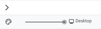
CoreMedia Studio’s preview includes a slider tool that lets users switch between devices with different resolutions, enabling the preview to perform a responsive transformation of the page. This means the preview will show the page as it would appear on a device with a different resolution — a mobile device, for instance.
Figure 1. Studio GUI Preview Slider
How to Configure the Preview CAE
To enable the responsive slider functionality, you must enable metadata tags in the FreeMarker templates. These tags handle communication between the CAE and CoreMedia Studio, allowing them to exchange meta information about the previewed page. See the CoreMedia Studio Developer Manual for more details on metadata tags. The following setting must be enabled in cae-preview-app/src/main/resources/application.properties:
cae.preview.metadata-enabled=true|
The responsive slider settings can also be configured individually for each theme via the theme’s settings JSON files. For more information, refer to the CoreMedia Frontend Manual. |
How to Integrate Metadata Tags in FreeMarker Templates
The following example shows how to use metadata tags in the Page.body.ftl template.
<#ftl strip_whitespace=true>

  <#-- responsive design slider information for studio -->
    <#assign sliderMetadata={
            "cm_preferredWidth": 1281,
            "cm_responsiveDevices": {
    <#-- list of the devices.
    naming and icons see: BlueprintDeviceTypes.properties
    the default icons are in studio-core, but you can define
    your own style-classes in slider-icons.css.
    -->
    <#-- e.g. iphone4 -->
      "mobile_portrait": {
      "width": 320,
      "height": 480,
      "order": 1,
      "isDefault": true
      },
    <#-- e.g. iphone4 -->
      "mobile_landscape": {
      "width": 480,
      "height": 320,
      "order": 2
      },
    <#-- e.g. nexus7 -->
      "tablet_portrait": {
      "width": 600,
      "height": 800,
      "order": 3
      },
    <#-- e.g. ipad -->
      "hybrid_app_portrait": {
      "width": 768,
      "height": 1024,
      "order": 4
      },
    <#-- e.g. nexus7 -->
      "tablet_landscape": {
      "width": 960,
      "height": 540,
      "order": 5
      },
    <#-- e.g. ipad -->
      "hybrid_app_landscape": {
      "width": 1024,
      "height": 768,
      "order": 6
      }
    }
  }
/>
To add support for new devices with different resolutions, simply extend this configuration accordingly.
Configuration in Studio
The Studio configuration is defined in the appropriate bundle files. The following listing shows the content of apps/studio-client/modules/studio/blueprint-forms/src/main/joo/com/coremedia/blueprint/studio/BlueprintDeviceTypes.properties.
      Device_mobile_portrait_icon=Resource(key='channel_mobile_portrait', bundle='com.coremedia.icons.CoreIcons')
      Device_mobile_landscape_icon=Resource(key='channel_mobile_landscape', bundle='com.coremedia.icons.CoreIcons')
      Device_tablet_portrait_icon=Resource(key='channel_tablet_portrait', bundle='com.coremedia.icons.CoreIcons')
      Device_tablet_landscape_icon=Resource(key='channel_tablet_landscape', bundle='com.coremedia.icons.CoreIcons')
      Device_notebook_icon=Resource(key='channel_notebook', bundle='com.coremedia.icons.CoreIcons')
      Device_desktop_icon=Resource(key='channel_desktop', bundle='com.coremedia.icons.CoreIcons')
      Device_hybrid_app_portrait_icon=Resource(key='channel_tablet_portrait', bundle='com.coremedia.icons.CoreIcons')
      Device_hybrid_app_landscape_icon=Resource(key='channel_tablet_landscape', bundle='com.coremedia.icons.CoreIcons')

      Device_mobile_portrait_text=Mobile
      Device_mobile_landscape_text=Mobile
      Device_tablet_portrait_text=Tablet
      Device_tablet_landscape_text=Tablet
      Device_notebook_text=Notebook
      Device_desktop_text=Desktop
      Device_hybrid_app_portrait_text=Hybrid App
      Device_hybrid_app_landscape_text=Hybrid App
      Device_desktopMode_text=Desktop
The configuration consists of two straightforward parts:
-
The icons displayed for each device type in the slider (top section).
-
The labels shown next to the slider for each device type (bottom section).
This configuration can be extended to introduce additional device types with custom icons.
To add a new device icon, declare a new class for the configured icon name in apps/studio-client/modules/studio/blueprint-forms/src/main/resources/META-INF/resources/joo/resources/css/slider-icons.css.
Is this page useful?