Frontend Developer Manual / Version 2104
Table Of Contents
The preview brick enables the fragment preview in CoreMedia Studio. When opening a content, the
editor will see a preview next to the editing fields on the right side of Studio.
Install this brick to make sure the preview not only shows the detail view of the content type, but also other predefined views.
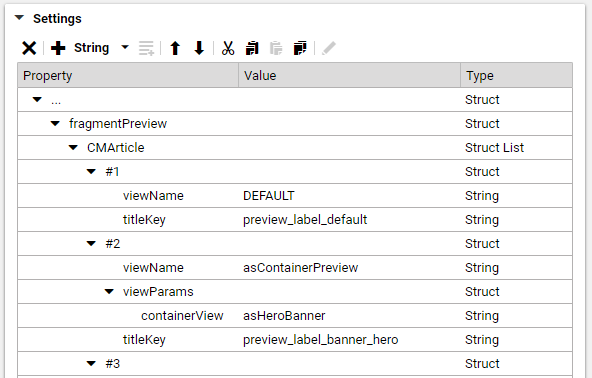
Compared to the default preview, the fragment preview displays multiple views of the given content. The different views are rendered as collapsible panels beneath one another. See Figure 6.11, “Example of fragmentPreview Setting Properties” and have a look at an example how to configure which views will be displayed in the fragment preview.
Technical Description
As a frontend developer working with FreeMarker templates, the entry point for any site is Page.fragmentPreview.ftl.
Per default, this template delegates to Page.ftl, unless another template with the same view overrides this behavior.
The Page.fragmentPreview.ftl in the preview brick does exactly this and
delegates to *.asPreview.ftl templates instead.
Templates and Parameters
Page.fragmentPreview.ftl*.asPreview.ftlObject.multiViewPreview.ftl
These *.asPreview.ftl templates are used to assign a list of views for the corresponding
content type and include the provided Object.multiViewPreview.ftl template to render each
view in a collapsible panel.
Default views can be configured as follows:
    <#assign defaultViews=[{
      "viewName": "asTeaser",
      "titleKey": "preview_label_teaser"
     }]/>
Alternatively assign views via bp.previewTypes macro, which then returns a list of views configured
in Content:
<#assign fragViews=bp.previewTypes(cmpage, self, defaultViews)/>

<@cm.include self=self view="multiViewPreview" params={
  "fragmentViews": fragViews
}/>
The bp.previewTypes macro retrieves the preview views of an object based on its content type hierarchy
or returns the passed default if no views could be found. These preview views can be changed by setting the
fragmentPreview Struct property in a settings document, which can either be linked to the
Linked Settings of the site's root channel or be part of a preview settings json file located in your
theme, as recommended. For more information about settings in themes see Section 4.7, “Settings”.
The titleKey property in the Linked Settings and in the example above defines the title
of a collapsible panel, displayed in the preview. Since it represents a key, a corresponding entry should be added
to a *.properties file located in your theme if it does not already exist in the translations
included in the brick.
The viewName property defines the view type in which the object is rendered. For example
asHeroBanner. To use the default simply put DEFAULT.
With help of the viewParams property, parameters can be send to the template for further configuration.


