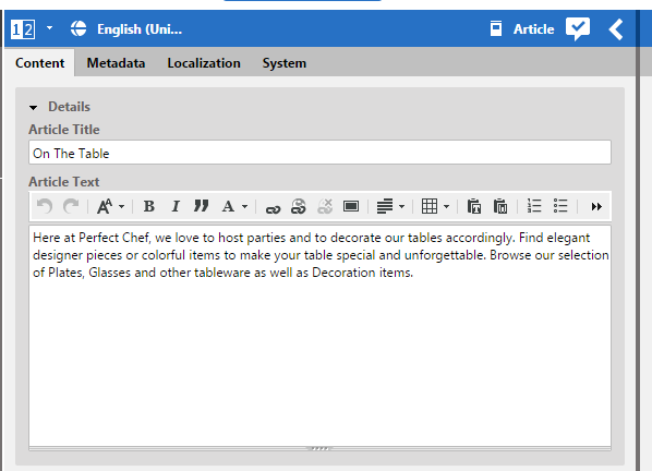
The following section describes how to customize the document forms, which constitute the main working component that your users will use. In earlier Studio versions, property fields were all contained in the main work area of the document form, and document metadata such as the filing information and version history were grouped in a collapsible section at the bottom of the form.
Current Studio versions offer a more flexible way of organizing your - potentially quite big - set of property fields into horizontal tabs. You can either use the default of two tabs, one for the main content properties, one for the metadata, respectively, or you can arrange properties freely on an arbitrary number of tabs.
Default two-tabbed document forms
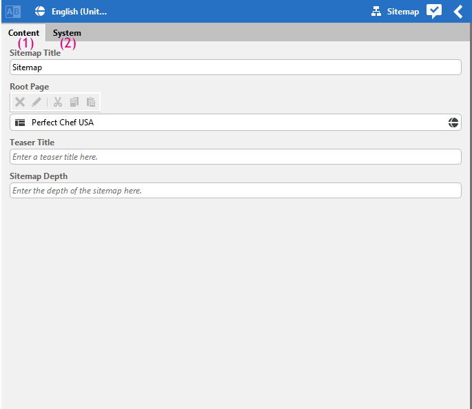
In the simple (default) case, a CoreMedia document form has two tabs: the primary form fields (1) that enable you to edit the content of the object and another tab (2) that shows metadata such as the path to the document, and the versioning information for that document.
Both tabs of the form are defined in separate definition files.
Forms should be defined by subclassing
the predefined DocumentForm component.
CoreMedia Studio offers at least one predefined property field for each property type available for CoreMedia documents. See Table 7.2, “Property Fields” for a list of all provided field types.
To customize a form, you need to adapt the respective form definition file (an EXML component)
in studio/blueprint-forms/src/main/joo/com/coremedia/blueprint/studio/forms/.
Containers used in the forms are defined in separate EXML files in the
/containers sub directory. The following code shows a simple example for a
standard CMArticle form definition:
<?xml version="1.0" encoding="UTF-8"?>
<exml:component xmlns:exml="http://www.jangaroo.net/exml/0.8"
                xmlns="exml:ext.config"
                xmlns:ui="exml:com.coremedia.ui.config"
                xmlns:editor="exml:com.coremedia.cms.editor.sdk.config">
  <editor:documentForm itemId="CMArticle">
     <items>
       <editor:stringPropertyField propertyName="subject"
        cls="cm-textfield-header"/>
       <editor:stringPropertyField propertyName="title"
        cls="cm-textfield-header"/>
       <editor:richTextPropertyField propertyName="text"/>
       <editor:imageLinkPropertyField
                 propertyName="media"linkListContentType="CMPicture"
                 dataPropertyName="data" />
       <editor:stringPropertyField propertyName="teaserSubject"
                 cls="cm-textfield-header"/>
       <editor:stringPropertyField propertyName="teaserTitle"
        cls="cm-textfield-header"/>
       <editor:richTextPropertyField propertyName="teaserText"/>
       <editor:blobPropertyField propertyName="thumbnail"
        contentType="image/*"/>
       <editor:linkListPropertyField propertyName="related" />
       <editor:stringPropertyField propertyName="linktext"/>
     </items>
  </editor:documentForm>
</exml:component>
Example 7.13. Article form
The property fields are defined in the <items> element of the
<editor:documentForm> element. Each property field has at least an
attribute propertyName which corresponds to the property name of the document
type. The property name must be specified for each field.
The document form also provides three additional properties to all fields
without specifying them explicitly: bindTo, hideIssues,
and forceReadOnlyValueExpression.
The standard property fields recognize these options and custom property fields
are encouraged to so, too.
See Section 7.4, “Customizing Property Fields” for details about
developing new property fields.
bindTo: A value expression that evaluates to the content object to show in the form. The content may change when the form content changes.hideIssues: This attribute is used to disable the highlighting of property fields with issues originating from validators. Validators will be described in Section 7.15.1, “Validators”. If set on the document form, it applies to all property fields.forceReadOnlyValueExpression: A value expression that evaluates to true when the document form and all of its property fields should be shown in read-only mode, for example when showing the document form on the left side in master comparison mode.
Other attributes might vary depending on the property type. The BlobPropertyField
editor, for example, has a property contentType that defines the MIME type. If
you want to hide a property, you can simply remove the related
<editor:<PropertyType>propertyField> element. The order of the editor
elements defines the order in the form.
| Property Field | Used for | Description |
|---|---|---|
stringPropertyField | String property | Shows string data. |
integerPropertyField | Integer property | Shows integer number. |
spinnerPropertyField | Integer property | Shows integer number, with arrow buttons to increase/decrease the current value, and mouse wheel support |
booleanPropertyField | Integer property with 0/1 Boolean values | Shows a checkbox indicating checked=1, unchecked=0. |
dateTimePropertyField | Date property | Shows date, time and time zone and provides appropriate picker elements. |
linkListPropertyField | Link List property | Allows drag and drop. |
contentListChooserPropertyField | Link List property | Shows a list of linkable contents and the current selection. |
richTextPropertyField | CoreMedia RichText (XML) property | Shows the text in a WYSIWYG style and provides a fully featured toolbar. |
xmlPropertyField | Generic XML property | Shows the raw XML text. |
blobPropertyField | blob property for all MIME types | Shows the image and provides an upload dialog. |
textAreaPropertyField | CoreMedia RichText (XML) property | Shows the text as plain text in a text area. |
textAreaStringPropertyField | String property | Shows the text in a text area. |
textBlobPropertyField | blob property of MIME type text/plain | Shows the blob as plain text in a text area. |
structPropertyField | CoreMedia Struct property | Shows a generic editor for structs. |
Table 7.2. Property Fields
Showing derived contents
In a multi-site setting
contents may be localized variants of each other.
By including the component DerivedContentsList into your form
you can show the list of derived contents of any given document.
Typically, this component is placed near the link list property that
associates a master document to a derived document.
  <editor:documentForm>
    <items>
      ...
      <editor:derivedContentsList/>
      ...
    </items>
  </editor:documentForm>
Customizing columns in link list properties
By default, the linkListPropertyField shows a document type icon, the name and the
lifecycle status for each linked document. You can configure an array of columns to be shown
using the columns property of the field component. Each array element must be an
Ext JS grid column object. The available fields of the store backing the grid panel are
name, status, type, and typeCls, These
fields represent the name, the lifecycle status, the document type name and a style class for a
document type icon, respectively.
If you need additional fields for your custom columns, you can add them using the
fields property. Each field should be a
com.coremedia.ui.config.dataField. The following example shows how a new column
uses a custom field to display the locale property of linked documents.
<editor:linkListPropertyField propertyName="variants">
  <editor:fields>
    <ui:dataField name="locale"
                  mapping="properties.locale"
                  ifUnreadable=""/>
  </editor:fields>
  <editor:columns>
    <editor:typeIconColumn/>
    <editor:nameColumn/>
    <editor:statusColumn/>
    <gridcolumn id="locale"
                width="30"
                dataIndex="locale"/>
  </editor:columns>
</editor:linkListPropertyField>
Whereas the configured fields are added to the default fields, the configured columns completely replace the default columns. That is, if you want to keep the predefined fields, you have to repeat their definitions as shown in the example.
Multi-tab document forms
In situations where the default split into a content and a properties tab is not sufficient for your users, you can also define any number of arbitrary tabs, and freely assign property fields to them. Doing so requires a slightly more complex definition of your document forms, where individual tabs are nested within the root element of your EXML definition. The following pseudo code snippet outlines the basic structure of a tabbed document form.
<?xml version="1.0" encoding="UTF-8"?>
<exml:component xmlns:exml="http://www.jangaroo.net/exml/0.8"
                xmlns="exml:ext.config"
                xmlns:editor="exml:com.coremedia.cms.editor.sdk.config">


  <editor:documentTabPanel>
    <items>
      <editor:documentForm title="First tab">
        <items>
          <editor:stringPropertyField name="property1"/>
          <editor:stringPropertyField name="property2"/>
        </items>
      </editor:documentForm>
      <editor:documentForm title="Second tab">
        <items>
          <editor:stringPropertyField name="property3"/>
          <editor:stringPropertyField name="property4"/>
        </items>
      </editor:documentForm>
      <editor:documentForm title="Third tab">
        <items>
          <editor:stringPropertyField name="property5"/>
          <editor:stringPropertyField name="property6"/>
        </items>
      </editor:documentForm>
       ...
    </items>
  </editor:documentTabPanel>
To register your custom document form, you need to add your EXML component to the
TabbedDocumentFormDispatcher, like so:
<editor:tabbedDocumentFormDispatcher>
  <plugins>
    <editor:addTabbedDocumentFormsPlugin>
      <editor:documentTabPanels>
        <my:myFormDefinition1 itemId="CMArticle"/>
        <my:myFormDefinition2 itemId="CMTeaser"/>
        ...
      </editor:documentTabPanels>
    </editor:addTabbedDocumentFormsPlugin>
  </plugins>
</editor:tabbedDocumentFormDispatcher>
The above code plugs into the TabbedDocumentFormDispatcher, and registers two
custom document forms from your own namespace titled my. Note that the
itemId still corresponds to the name of the document type you want to apply your
form for.
The document forms registered with the dispatcher are automatically
used for both the regular document form and for left-hand form of
the version comparison view and the master side-by-side view.
When used on the left side, the forceReadOnlyValueExpression
passed to the form is set to true, allowing your form
to switch into a read-only mode.
When you choose to use multi-tab document forms, also note that you need to specify the
built-in metadata components such as <editor:versionHistory> or
<editor:documentInfo>, because they are not automatically added. It is
common practice to place these on a separate tab titled
System or similar (which is also what
CoreMedia Blueprint does), but of course you can add them
to any place in the form that you want.
Collapsible Property Fields
To add several property fields to a group with an additional title, the component
<editor:collapsibleFormPanel> can be used. All documents forms
of CoreMedia Blueprint do use it to provide
a better overview about related fields.
Additionally, the collapsible form panel persists the collapsed status. For example, when the collapsible form panel is collapsed for the teaser title and teaser text of an article, the group is collapsed for all newly opened article documents too (except it contains an invalid field). This status information is stored in the user preferences of the user, so if the user logs into Studio on another computer, the same state will be restored.
<editor:collapsibleFormPanel title="{CustomLabels_properties.INSTANCE.PropertyGroup_Details_label}" itemId="detailsDocumentForm">
  <items>
    <editor:stringPropertyField propertyName="title"/>
    <editor:richTextPropertyField propertyName="detailText"
                                  initialHeight="200"/>
  </items>
</editor:collapsibleFormPanel>
Each declaration of an <editor:collapsibleFormPanel> element should contain the attributes title and
itemId. The title attribute applies a title to the panel (and also provides a meaning to the group).
It is also used as click area for collapsing the panel.
The itemId should be applied to persist the state of the group. If no itemId is provided, the collapsible
state is not stored in the user preferences and therefore not applied when new documents of the same type are opened.


