 What you will learn
- Welcome screen and options
- Main editing areas
- Preview
- All buttons and icons explained
 Prerequisites
- A working Login to CoreMedia Studio
 Target Audience
This guide is for Editors, Newbies, Decision makers.
Table of Contents
Introduction
CoreMedia Studio is a well-structured, yet multifaceted tool that enables you to find, create, update, and manage your content quickly and efficiently. This guide provides a concise overview of the interface.
|
Depending on your CoreMedia Studio setup, not all described controls may be available, or you may see additional items. This guide describes the default configuration and highlights common customizations where relevant. |
Getting Started – Welcome Screen
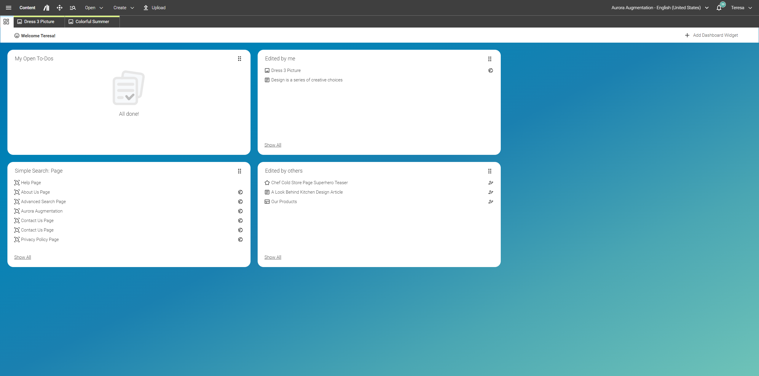
When you log into Studio for the first time (or if you have previously closed all content tabs), the Studio start screen appears as follows:
-
At the top, you will find the Header Bar, which offers various functions and actions.
-
Below is the Welcome dashboard with shortcuts (internal and external links), your Bookmarks, and a list of content items you last edited.
Whether you open one or multiple content items, the Studio structure remains the same – content is always displayed beneath the Header Bar (1).
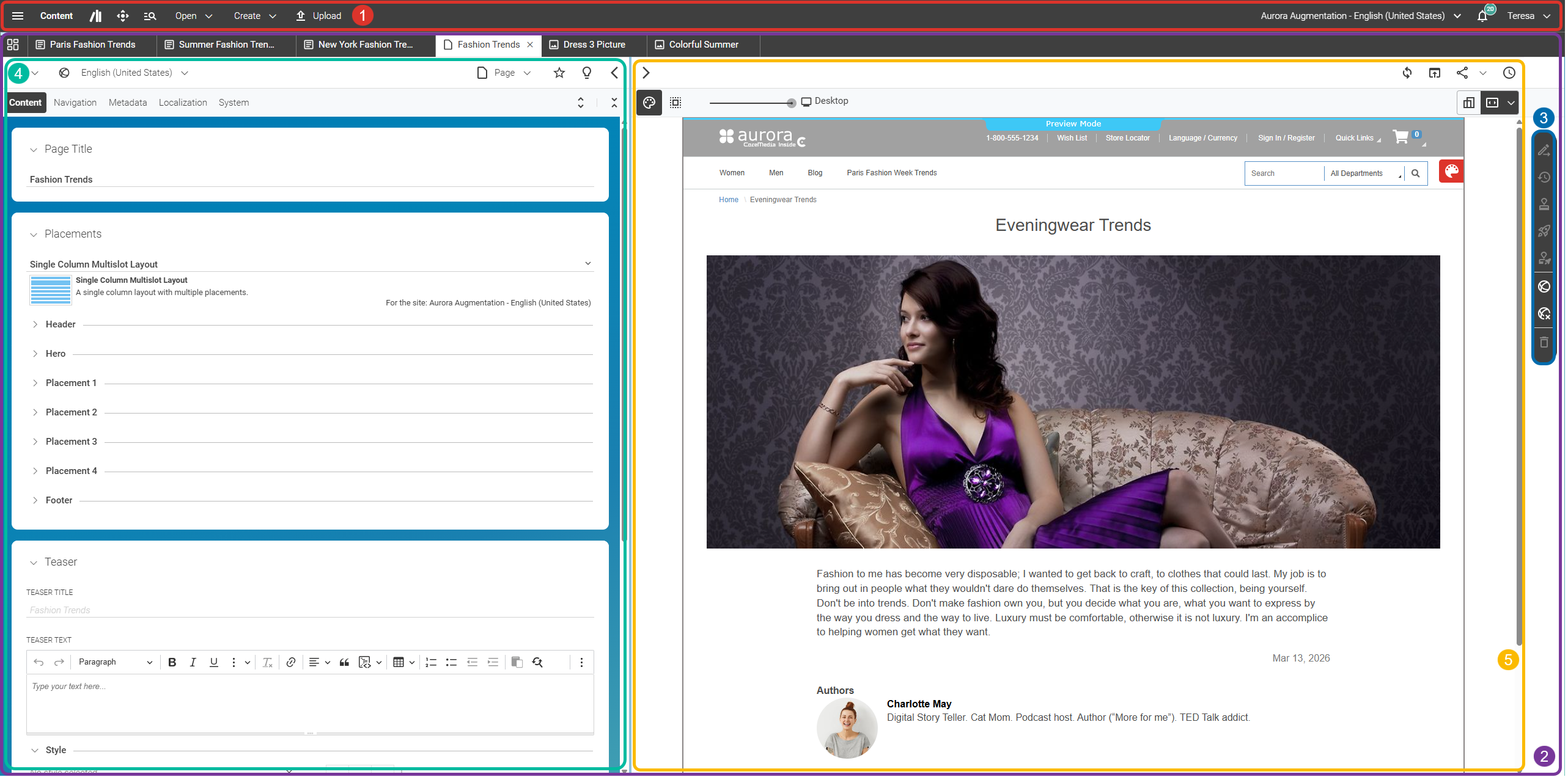
The Content Area (2) displays opened content items and consists of three main areas, from left to right:
-
Action Bar (3)
-
Form View (4)
-
Preview (5)
All properties of a content item can be found in the Form View. Here, you can edit and manage your content in many ways, for example:
-
Create and edit text
-
Crop images
-
Link content items
The Preview displays the selected content items in real time. The preview on the right reloads as soon as you make a change in the Form View. In the Action Bar at the top right, you will find all buttons to save, revert, publish, or withdraw your content item.
Header Bar Overview
The following screenshot provides a high-level, color-coded overview of all elements in the header bar. Each element is described in detail in the subsections below, starting with "Main Menu".
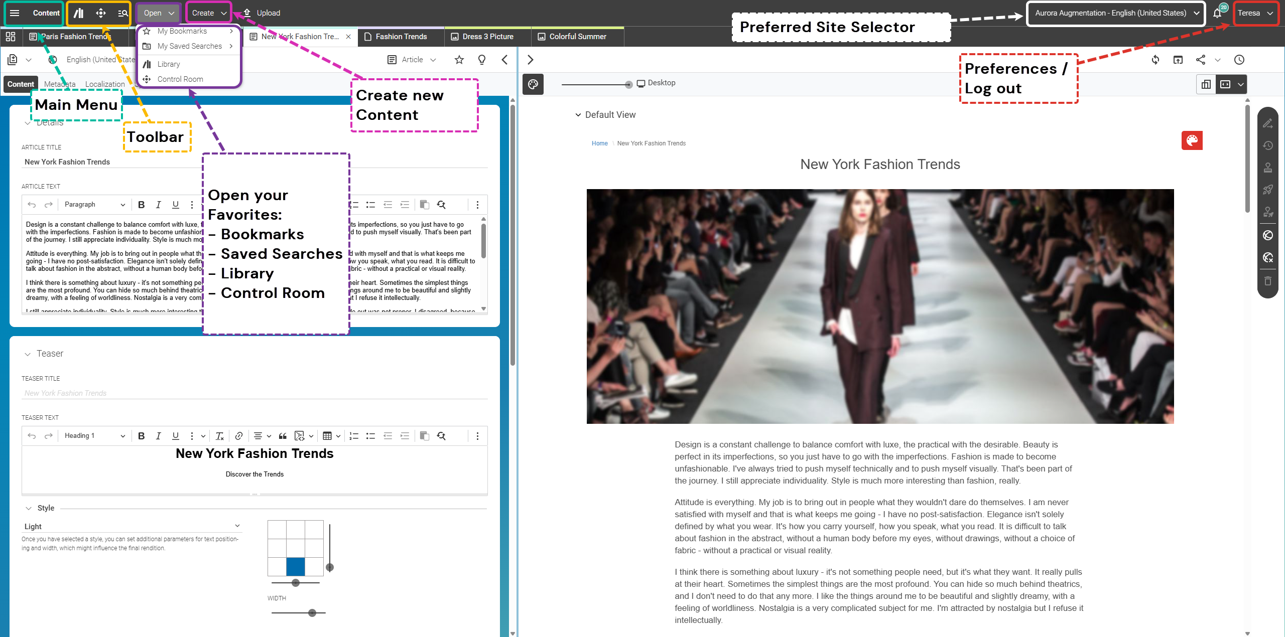
Main Menu
The Apps control opens the Main Menu. Here, you have access to various applications available within Studio. The Main Menu also contains the same options as your Preferences Menu.
|
Depending on your CoreMedia Studio setup, you may see a different listing than the example screenshot. |
For a description of the available apps and more information, please visit our documentation section and refer to the Studio User Manual.
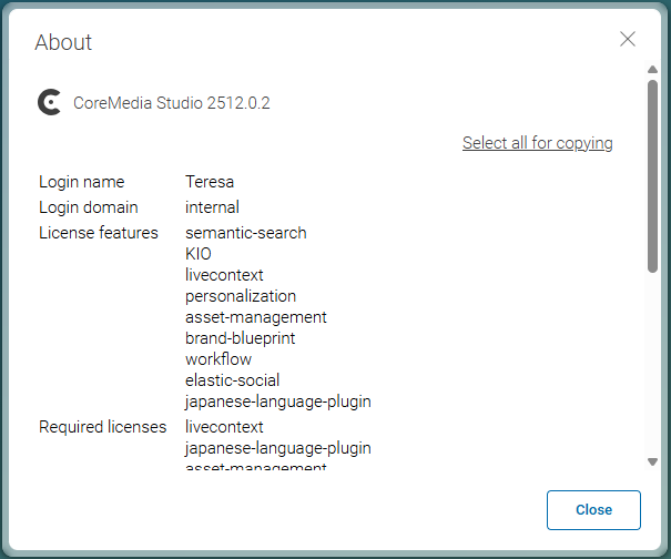
You can also find the version number of your CoreMedia Content Cloud system in the lower-left corner of the Main Menu. The About dialog provides more information, including license details, server details, and module versions. This information is helpful for bug or feature requests – your IT team will appreciate it! Example of the About dialog:
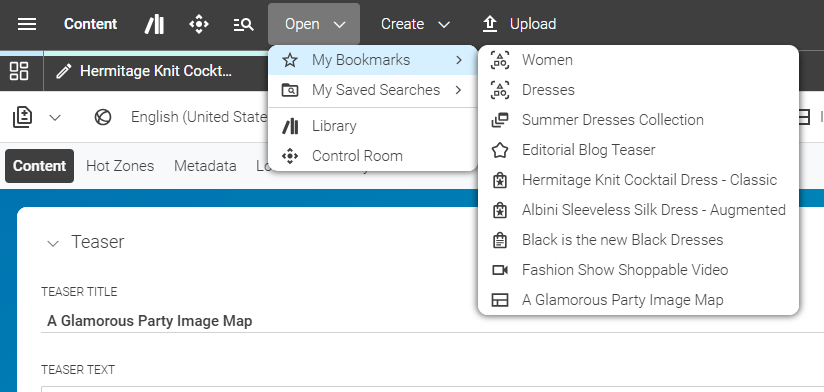
Favorites/Bookmarks
Access your Bookmarks and Saved Searches using the Open menu in the header bar. Like in a classic browser, you can bookmark content items and folders. Look for the star symbol in your Preview toolbar or in the Library to bookmark or remove a bookmark. The screenshot below shows an example set of bookmarks (submenu to the right) and saved searches (below the “Bookmarks” menu item). Saved searches allow you to quickly access search configurations. See the how-to guide “Using Filters (Library)” for more details on creating these shortcuts.
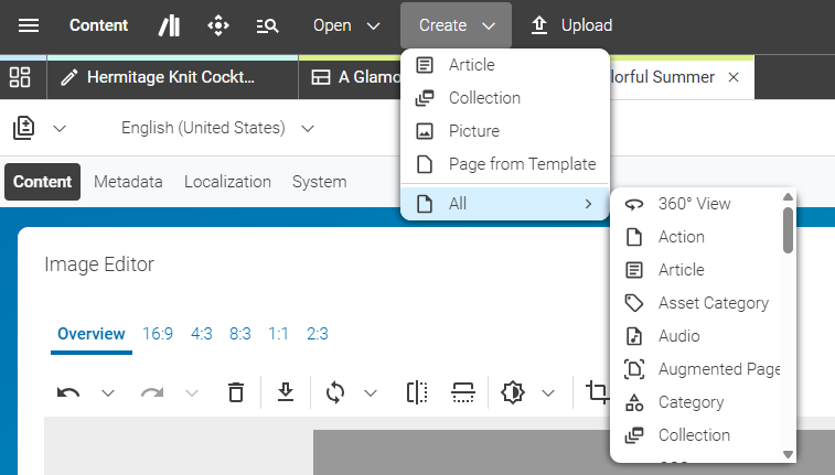
Create New Content
There are multiple ways to create content in CoreMedia Studio. One way is to create content from scratch via this menu. Several features are included to make this easier:
-
In the upper section of the menu, you can find your preferred content types. You can configure your preferred content types in your Preferences.
-
This section is followed by the Page from Template function. This allows you to create pages based on templates you or your team have previously set up. A template is a prototype of a page with predefined properties such as linked content items, theme, metadata, or visibility. See the how-to guide “Creating new Templates using the Create from Template Dialog” for more details.
-
The menu item All opens a submenu listing all available content types. Which content items are available depends on your Studio setup — refer to the Studio User Manual for a description of commonly available items or your team’s internal documentation for custom content types.
-
The menu item Upload Files allows you to import external files, which are converted into content items. See the how-to guide “Uploading Pictures and Other Files” for a detailed description.
Toolbar
The toolbar provides access to various features and functions, such as the Library, Control Room, Quick Search, and Info Center.

-
Library: Opens or closes the Library. Shortcut: F3.
-
Control Room: Opens or closes the Control Room. Shortcut: F4.
-
Quick Search: Opens a search dialog to quickly find and filter content items. Shortcut: CTRL+ALT+Space.
-
Info Center: Notifications and Active Jobs are bundled here. Access relevant information in your inbox.
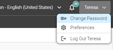
Preferences + Log Out
Click your login name in the upper right corner to access your Studio preferences, change your password, or log out of Studio.
|
If you use CoreMedia Content Cloud Service, you will also find a menu item to return to the Cloud Manager. |
The following screenshot shows the available options:
Overview of the Content Area
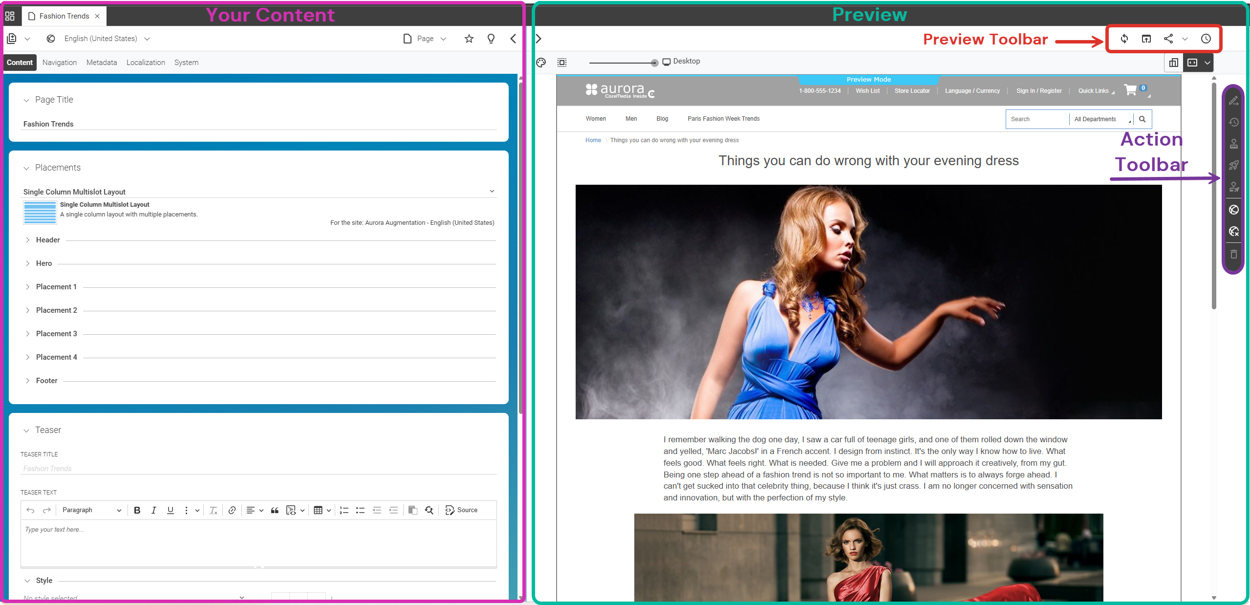
Your Content
The area below the Header Bar displays your currently opened content items. Each content item is displayed in one tab and consists of the Form View (left), where you can see and edit all your content, and the Preview (right). You can collapse and expand the two panes for each content item. The content tab works like standard browser tabs: the currently active tab is highlighted, and you can close or rearrange tabs as needed.
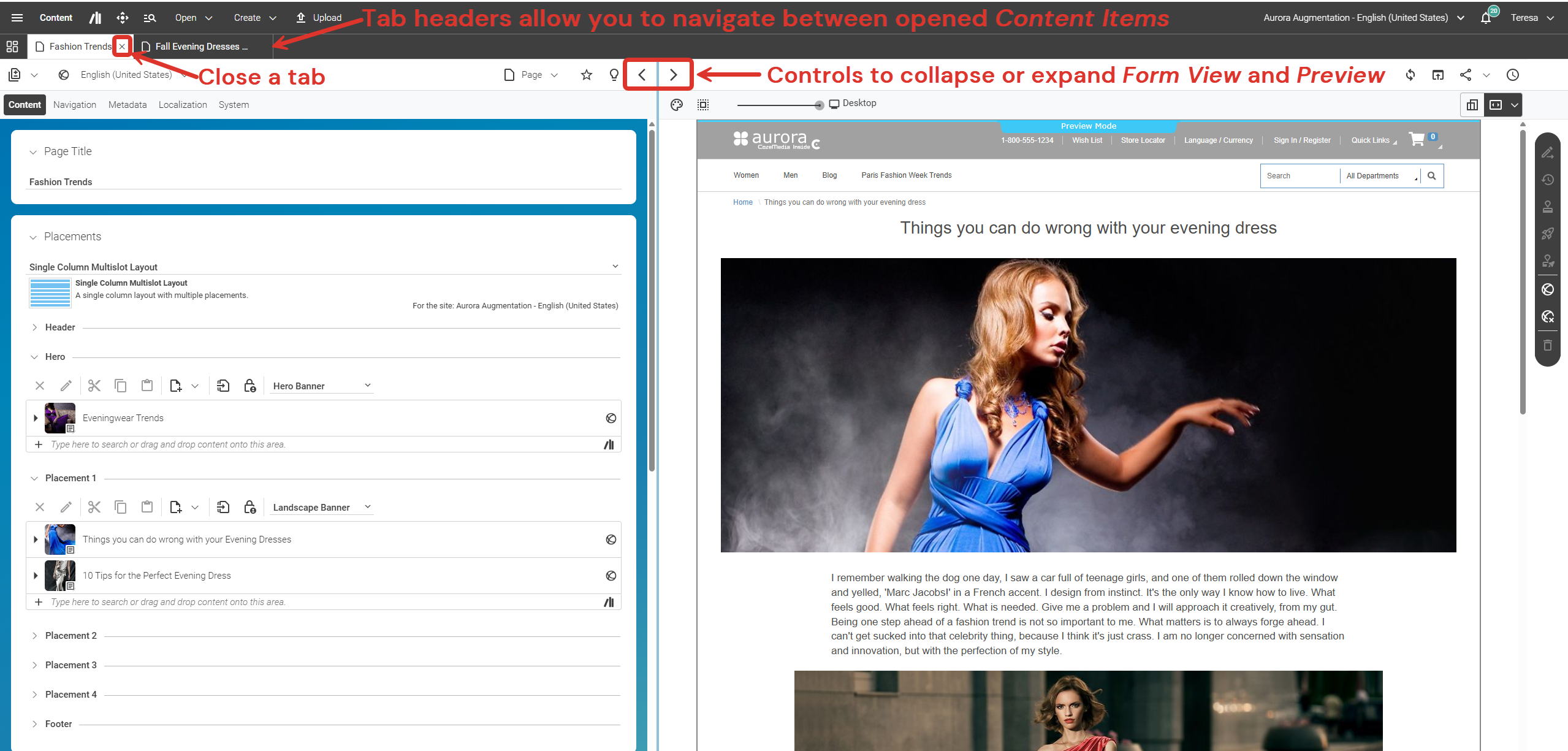
Preview
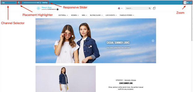
This area is a What-You-See-Is-What-You-Get (WYSIWYG) Preview of your current content item. It reloads automatically when you make changes in the Form View and allows you to navigate your content as if browsing a standard website. Additional features include Zoom, Responsive Slider (to preview content in various screen sizes), Placement Highlighter (to frame content slots within the preview), and – if you use an omnichannel approach – the Channel Selector (to switch between different renditions for your target channels).
Preview Toolbar
The Preview Toolbar is part of the fully integrated WYSIWYG Preview.
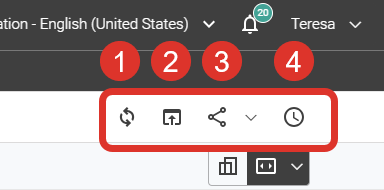
Figure 1. Preview Toolbar
-
Reload Preview: Reloads the Preview. If you have navigated away from the current content item, this button brings you back to its preview.
-
Open Preview in Browser Tab: Opens a Preview outside of Studio.
-
Share Preview Options: Options to share the preview link, for example with colleagues who are not Studio editors.
-
Show Preview for a Specific Time: Allows you to preview content at a specific date/time to review scheduled content appearances.
Action Toolbar
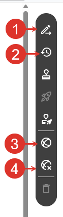
The Action Toolbar contains all the required functionality to manage your content life cycle. Standard features include:
-
Applying changes
-
Reverting changes
-
Starting a publication or withdrawal workflow
Depending on your Studio implementation or feature configuration, fewer or additional custom controls may be available.
-
Apply Changes: Applies your recent changes, creating a new version of your content that you can revert to or compare with other versions. It also unlocks the content item so other editors can make changes.
-
Revert Changes: Reverts your recent changes, restoring the content to the previously applied version and releasing the lock for other editors.
-
Start a Publication Workflow: Starts the publication process for the current content item. A dialog will guide you through the publication process.
-
Withdraw Content: If the current content is published, click this button to initiate the withdrawal process. The system will validate whether the content can be safely withdrawn without causing issues elsewhere (for example, if the page is still linked from another published item). If dependencies exist, the withdrawal will be aborted and a dialog will display a list of linking items, allowing you to resolve these connections before completing the withdrawal.
Is this page useful?