Blueprint Developer Manual / Version 2301
Table Of ContentsThe Brand Blueprint provides a modern, appealing, highly visual website template that can be used to start a customization project. It demonstrates the capability to build localizable, multi-national, non-commerce web sites.
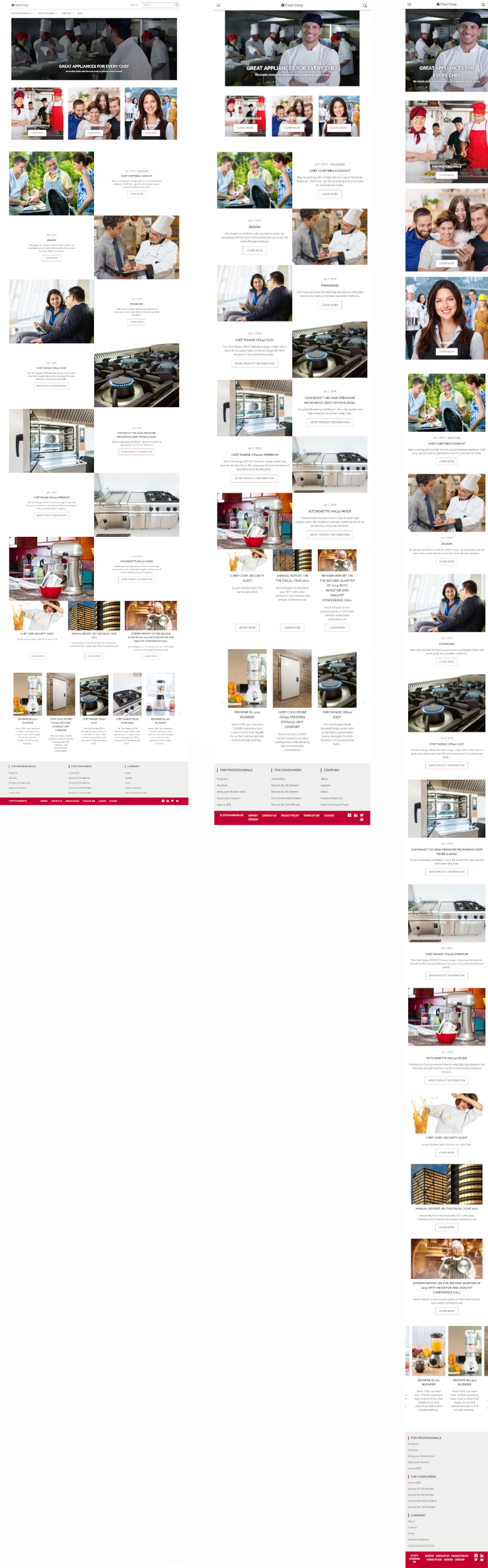
Based on a fully responsive, mobile-first design paradigm, the Brand Blueprint leverages most of our bricks and Design framework for easy customization and adaptation by frontend developers. It is a child theme, inherited from the Shared-Example Theme.

Note
For more information about the themes please see the Section 6.1, “Example Themes” in Frontend Developer Manual
It scales from mobile via tablet to desktop viewport sizes and uses the CoreMedia Adaptive and Responsive Image Framework to dynamically deliver the right image sizes in the right aspect ratios and crops.