


Studio Developer Manual / Version 2412.0
Table Of Contents
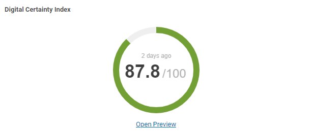
A GaugeFeedbackItem renders a colored percentage gauge graph with additional labels and links.
They are created trough method GaugeFeedbackItem.builder.
| Property | Type | Default Value | Description |
|---|---|---|---|
| collection | String |
null
| The sub tab the panel should be rendered too. |
| title | String |
null
| The title of the panel. |
| help | String |
null
| Help text that, if set, will be rendered as a help icon next to the title. |
| value | float |
0
| The value of the score. |
| decimalPlaces | int |
0
| The number of decimal places for the value. |
| targetValue | float |
0
| The target percentage to achieve. If set, a target indicator will be rendered on the gauge. |
| gaugeTitle | String |
null
| The title that is shown below the gauge. |
| url | String |
null
| If set, a link button will be rendered below the gauge. |
| linkText | String |
null
| The text used for the gauge link button. |
| age | long |
0
| The last time the data of this gauge was fetched, milliseconds from 1970. |
| color | String |
null
|
If set, the whole bar will be rendered with this color.
The reverseColors attribute is ignored in this case.
|
| reverseColors | boolean |
false
| If true, the color of the bar be reversed (green to red). |
Table 9.16.
FeedbackItem GaugeFeedbackItem
