Studio User Manual / Version 2204
Table Of Contents
The list of teaser overlay styles shown in the Style dropdown box is aggregated from styles
found in /Settings/Options/Settings/Teaser Styles and
<SiteName>/Options/Settings/Teaser Styles. A teaser overlay style is configured in
a CMSetting document.
In order to define your own style, proceed as follows:
Global style: Create a content item of type
CMSettingin/Settings/Options/Settings/Teaser Styles.Site specific style: Create a content item of type
CMSettingin<SiteName>/Options/Settings/Teaser Styles.Define the appearance of the style in the dropdown box with the following properties:
| Property | Type | Description |
|---|---|---|
title
|
String
| The title to show in the "Style" combo box on the teaser form. |
description
|
String
| The description to show in the "Style" combo box on the teaser form. |
style
|
Struct
| Contains the technical styles. |
Table 4.22. Configurable properties for a teaser overlay style
Define the appearance of the overlay on the teaser with the following properties:
| Sub-Property | Type | Description |
|---|---|---|
color
|
String
| Contains the value of a CSS color property to be used as the color of the overlay. |
backgroundColor
|
String
| Contains the value of a CSS color property to be used as the background color of the overlay. |
additionalStyles
|
String
|
Contains plain CSS styles to be attached to the style property of the overlay.
|
cls
|
String
| Contains one or more CSS class names to be attached to the overlay. |
textCls
|
String
| Contains one or more CSS class names to be attached to the text element of the overlay containing the contents of the Teaser Text field. Predefined CSS classes are "cm-richtext--dark-shadow" and "cm-richtext--light-shadow" which can be used to improve legibility for the overlays on some backgrounds by adding a dark or light text shadow. |
ctaCls
|
String
| Contains one or more CSS class names to be attached to the call-to-action button element. Only applies if you have added a call-to-action button (see Section 4.6.9.3, “Setting a Call-to-action Button” for details). |
Table 4.23. Configurable properties for the 'style' sub struct
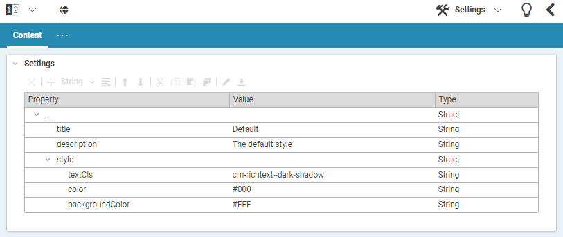
Figure 4.80, “ Example style definition ” shows the configuration of the default style.