


Frontend Developer Manual / Version 2310
Table Of ContentsThe Shared-Example Theme comes with a modern and minimal fully responsive design. Build on Twitter Bootstrap and our bricks. It demonstrates the capability to build localizable, multi-national, experience-driven websites.

Note
This theme is the parent theme for Calista Theme and ChefCorp Theme. Read Section 5.5, “Theme Inheritance” for more information about it.

Caution
This theme is the shared theme as foundation for the Blueprint themes. Even though it's a good example how to write themes, you should not use it as a base for your custom themes to avoid conflicts in the future. You should always create new themes with the pnpm run create-theme script, described in Section 5.1, “Creating a New Theme”.
Features
Favicons
The Shared-Example Theme provides embedded favicons defined in Page._favicon.ftl.
Responsive Page Grid
The Shared-Example theme renders the placements of a site in an own responsive page grid based on the CSS flexible box layout model (flexbox).
The theme's page grid works similar to the Twitter Bootstrap's grid system and is defined in Container.asGrid.ftl and _flex-grid.scss.
It can be used as follows:
<div class="cm-flex-row cm-flex-row--center">
  <div class="cm-flex-col-xs-6 cm-flex-col-md-2"> ... </div>
  <div class="cm-flex-col-xs-6 cm-flex-col-md-2"> ... </div>
  ...
</div>
The above example adds the cm-flex-row--center class to the row div, which displays all columns
centered in the corresponding row.
The Shared-Example theme also comes with templates to render different placements of a site uniquely.
The PageGridPlacement.ftl includes different templates for placements, that must be named
"header", "footer" or "footer-navigation" in your site and therefore renders their layout different from all
other placements.
Banners
The Shared-Example Theme is using Example Bricks to include different banner variants hero, portrait, landscape, square, left-right and carousel.
All other items in placements are rendered as teasers in Container.asContainer.ftl.
Layout
The Shared-Example theme makes use of the footer brick to display the placements footer and footer navigation. It also uses the navigation brick to enable a navigation section below the header and inside the mobile header menu.
Elastic Social
The Elastic Social feature supports comments for articles. See the Chapter 1, Preface in Elastic Social Manual to learn more about Elastic Social.
Editorial Blog
The Shared-Example theme includes authors in articles and supports author detail pages for the Editorial Blog. Authors are displayed below the article text in detail pages and above the title in the default teaser layout. It also makes use of the feature to load more items of a CMQueryList via AJAX. The blog pages and author detail pages (for related items) show three items and a "load more" button, if more items are available.
Search
The Shared-Example theme makes use of the search brick to display a search input field in the header of the page. After submitting his search, the user will be redirected to a search page, where he can get an overview of the results, adjust filters or alter his search term.
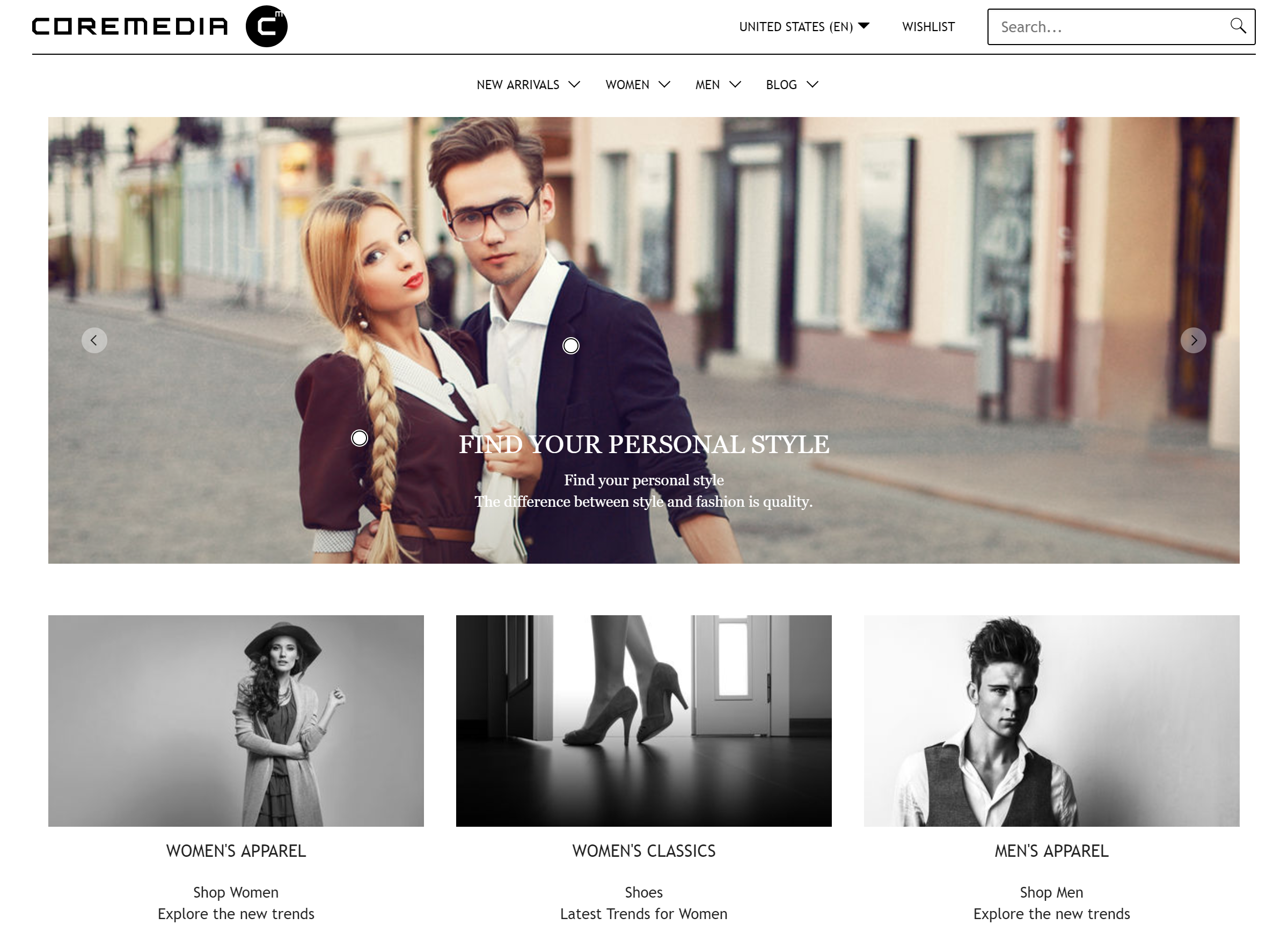
Hero Banner
The Hero Banner layout variant renders a banner with great imagery. It fills the whole width of the grid on all devices. Important: Different screen orientations need different crops. On mobile devices the image format changes to 1:1. If a placement or a collection is filled with multiple teasables, these items will be rendered as carousel with arrows indicating and navigating to the previous and next items.
The appearance of banners, rendered in the hero layout variant can differ completely from the usual layout. The following table shows which content types will be enriched with additional elements or rendered as a whole other component:
| Type | Appearance |
|---|---|
| Product | Renders an additional "Shop Now" button if product offers this option |
| HTML | Renders the plain HTML |
| ImageMap | Renders an ImageMap with HotZones, Popups and indicators |
Table 6.1. Special Hero Banner Types
Portrait Banner
The Portrait Banner Layout Variant renders a simple banner that has a portrait image and text below the image. Advanced teaser management is ignored. It is intended for products.
The following render settings are different to the default settings for default banner:
renderTeaserText: truerenderEmptyImage: falseenableTeaserOverlay: false
The appearance of banners, rendered in the portrait layout variant can vary from the usual layout. The following table shows which content types will be enriched with additional elements or rendered as a whole other component:
| Type | Appearance |
|---|---|
| Product | Renders an additional "Shop Now" button if product offers this option |
| HTML | Renders the plain HTML |
| Download | Renders an additional download icon, file name and file size |
| Gallery | Renders the contents of the gallery as items in a new row, even if the row prior or after the gallery content is not fully filled |
Table 6.2. Special Portrait Banner Types
Landscape Banner
The Landscape Banner Layout Variant renders a simple banner that has a landscape image and text below the image. Advanced teaser management is ignored.
The following render settings are different to the default settings for default banner:
renderTeaserText: truerenderEmptyImage: falseenableTeaserOverlay: false
The appearance of banners, rendered in the landscape layout variant can vary from the usual layout. The following table shows which content types will be enriched with additional elements or rendered as a whole other component:
| Type | Appearance |
|---|---|
| Product | Renders an additional "Shop Now" button if product offers this option |
| HTML | Renders the plain HTML |
| Download | Renders an additional download icon, file name and file size |
Table 6.3. Special Landscape Banner Types
Square Banner
The Square Banner Layout Variant renders a simple banner that has a square image and text on the image. Advanced teaser management is ignored.
Left Right Banner
The Shared-Example theme provides a Left-Right Banner layout variant of CMTeasable
as teaser. It renders content items each in a row with a left aligned media content followed by a right aligned text
and vice versa.
The layout is defined in the template in Container.asContainer[left-right].ftl.
They do not call an additional grid template as default. As layout variant of the bean CMTeasable
the parameters described in Default Banner can be used. It disables the
teaser overlay functionality and shows authors, a display date, empty image background and a "load more" button for
CMQueryList.
The following render settings are different to the default settings for default banner:
renderTeaserOverlay: falserenderAuthors: truerenderDate: true
The appearance of banners, rendered in the left-right layout variant can vary from the usual layout. The following table shows which content types will be enriched with additional elements or rendered as a whole other component:
| Type | Appearance |
|---|---|
| Product | Renders additional price, offer price and a "Shop Now" button if product offers this option |
| HTML | Renders the plain HTML |
| Download | Renders an additional download icon, file name and file size |
| Gallery | Renders the contents of the gallery as items, like collections |
| ImageMap | Renders the imagemap in front of the image |
| Video | Renders the video as autoplayed, looped and muted inline video, if no image is available. Also renders a play button. A Click on the banner will open a large version of the video in a lightbox. |
| Audio | No special view |
| 360° Spinner | No special view |
Table 6.4. Special Left-Right Banner Types
Carousel Banner
The Carousel Banner Layout Variant renders a carousel containing banners. The banners include a portrait image and text below the image. Advanced teaser management is ignored. There are no CTAs shown.
