Studio User Manual / Version 2104
Table Of ContentsFor specific views of certain content types, such as the "Hero Teaser" view of an article or teaser, you can freely position and style an overlay containing the teaser text. If you have added a call-to-action button (see Section 4.6.9.3, “Setting a Call-to-action Button” for details), this button will be positioned inside the overlay together with the text.
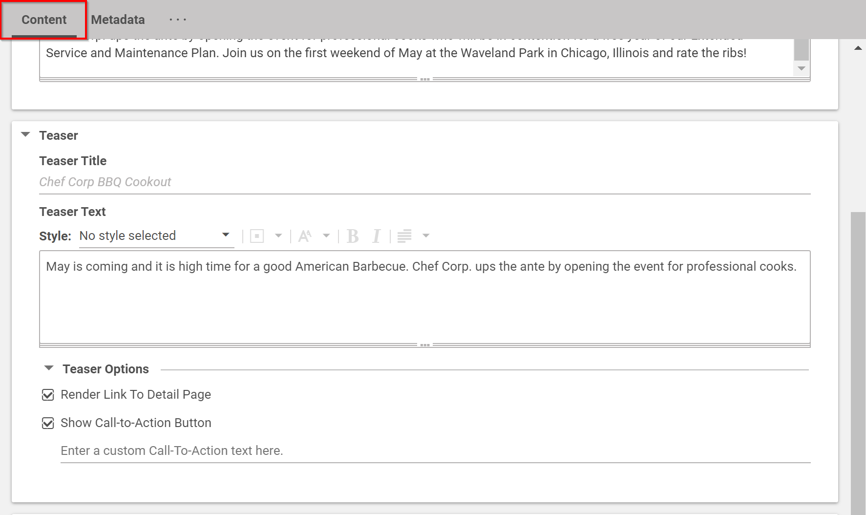
In the Content tab of the content item open the Teaser field.
Only the content of the Teaser Text field is used for the movable text. The content of the Teaser Title field is omitted.
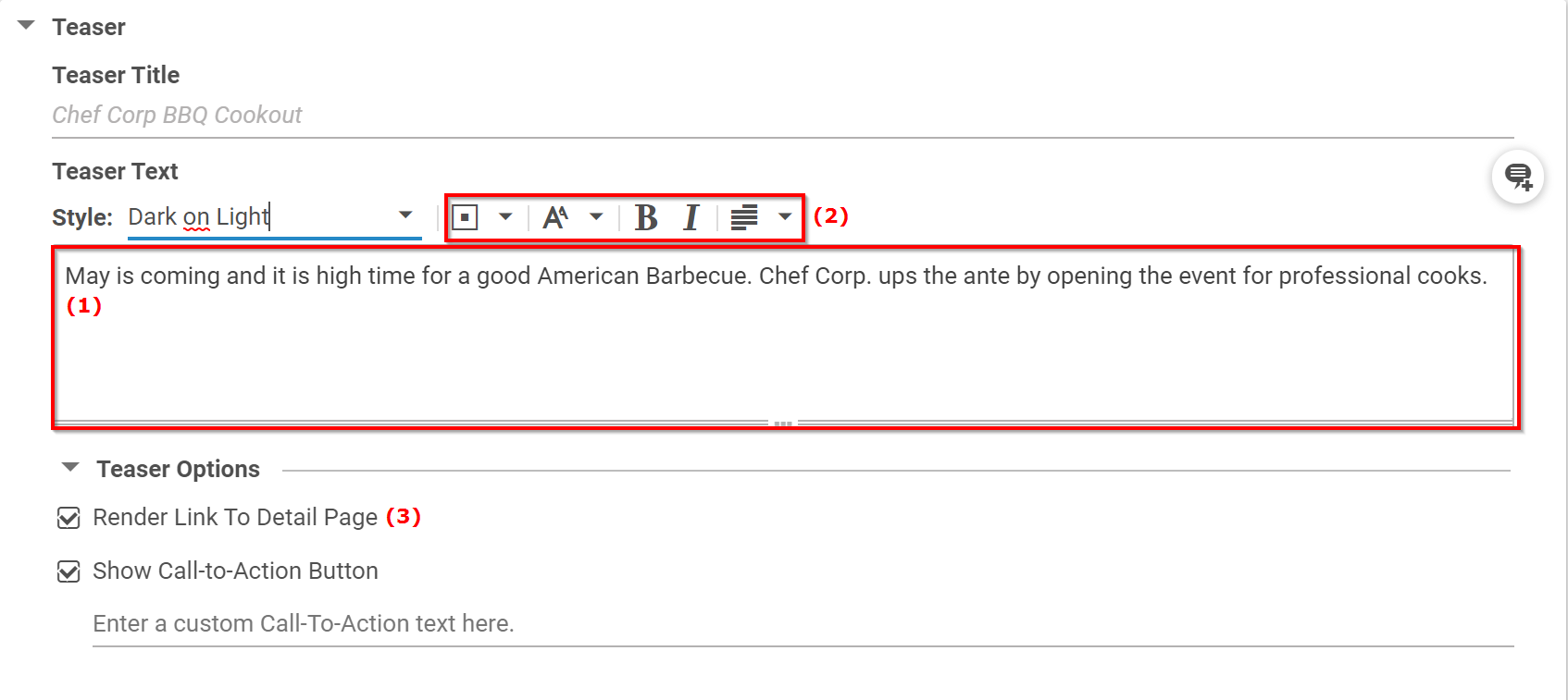
In the Style dropdown box select a global style for the text. The style defines the appearance of the overlay and its inner elements such as the font color and background. Your available styles may differ from the styles in the image below.
Your available styles may differ from the styles in the image below.
Enter your text in the text field (1) and use the buttons in the toolbar (2) to format your text. You can choose a style, format the text as bold or italic and select the text alignment per paragraph. See Section 4.6.3, “Editing Formatted Text” for details about text formatting.
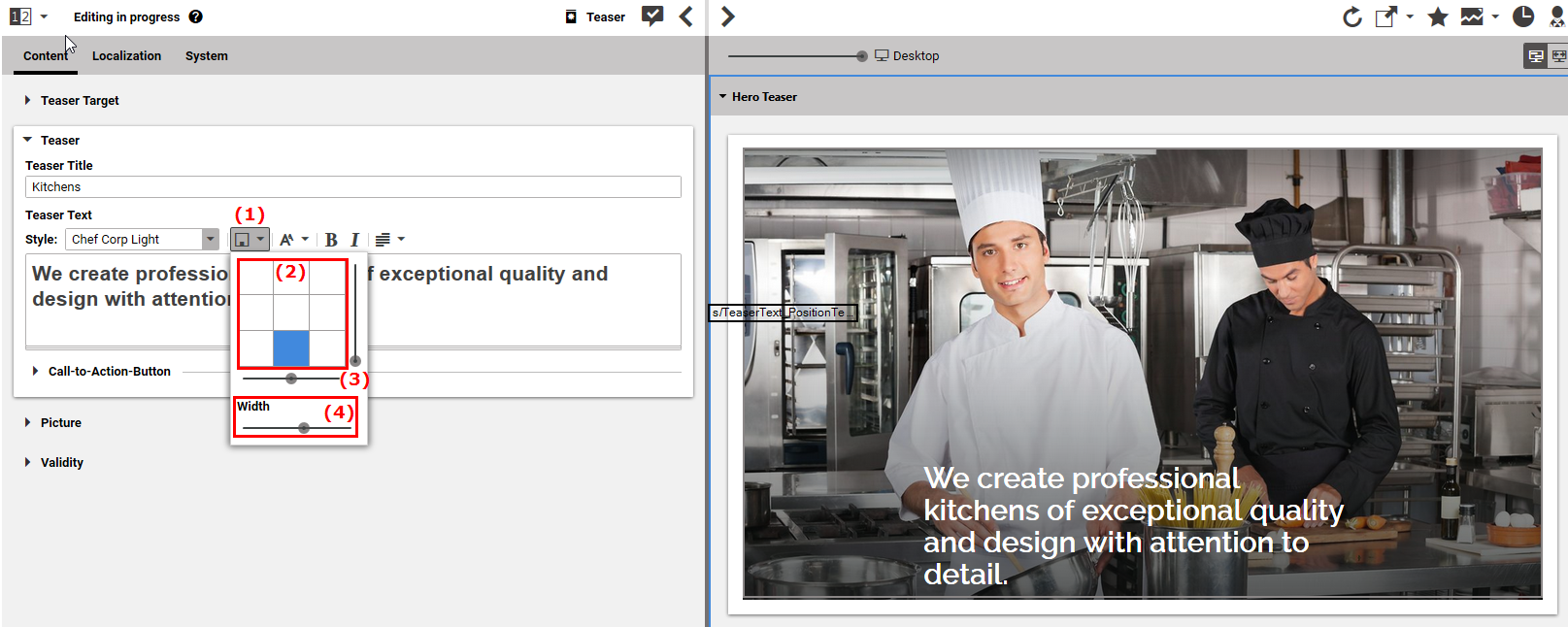
Click the Position icon (1) in order to open the position menu. You can either click on of the squares in field (2) to position the overlay at the corresponding location in the image or use the sliders (3) to position the text more precisely.
With the Width slider (4), adapt the width of the overlay.
When you want to link from the teaser to the detail page of the content, select the Render Link To Detail Page checkbox (3).


