


Solution Overview for Business Users / Version 2512.0
Table Of Contents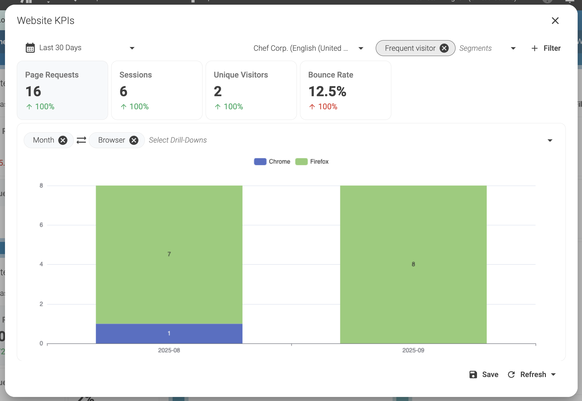
The data in the image refers to the number of page requests in a period of 30 days. The graph always shows the selected metric. To select a metric, click on the metric rectangle (Page Requests, Sessions, Unique Visitors, Bounce Rate) and the background of the metric rectangle will become light gray.
The percentages in green or red below the metrics indicate the increase or decrease of the metric relative to the previous 30 days. If the variation is good for the business, the percentage will appear green, otherwise it appears red. For example, if the bounce rate increases, that means that more visitors are abandoning the website after the first page.
If the bounce rate increases in this period, it means that the website is losing more visitors in this period than in the previous period, and that is bad for the business. In this case, the increase in the percentage will appear red.
Select data

In this example, you can view data collected during the period of the last 30 days from the site Chef Corp. The last 30 days include days from August and September of 2025.
The displayed data is also filtered by segments and is showing only page requests from visitors in the segment Frequent Visitors.
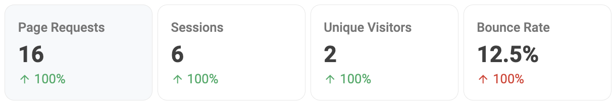
Graph
The graph shows the number of page requests aggregated by month and browser. The first column of the graph shows page requests in August of 2025 (2025-08).
As you can see, during this month visitors in the Frequent visitor segment made 1 page request using Chrome (blue) and 7 page requests using Firefox (green).
The second column shows page requests in September of 2025 (2025-09). During these days, visitors in the Frequent visitor segment made 8 page requests using Firefox (green).
