The Brand Blueprint is an extension to the CoreMedia e-Commerce Blueprint. It provides a modern, appealing, highly visual website template that can be used to start a customization project. It demonstrates the capability to build localizable, multi-national, non-commerce web sites.
Based on a fully responsive, mobile-first design paradigm, the Brand Blueprint leverages the Twitter Bootstrap Grid and Design framework for easy customization and adaptation by frontend developers.
It scales from mobile via tablet to desktop viewport sizes and uses the CoreMedia Adaptive and Responsive Image Framework to dynamically deliver the right image sizes in the right aspect ratios and crops.
The responsive navigation visualizes 3 levels, even though the navigation structure can be arbitrary deeply nested. The floating header and the footer can be configured and re-ordered in content settings. Navigation nodes with URLs to external sites can be added via content.
Four new site-specific page types are introduced:
- Brand Homepage
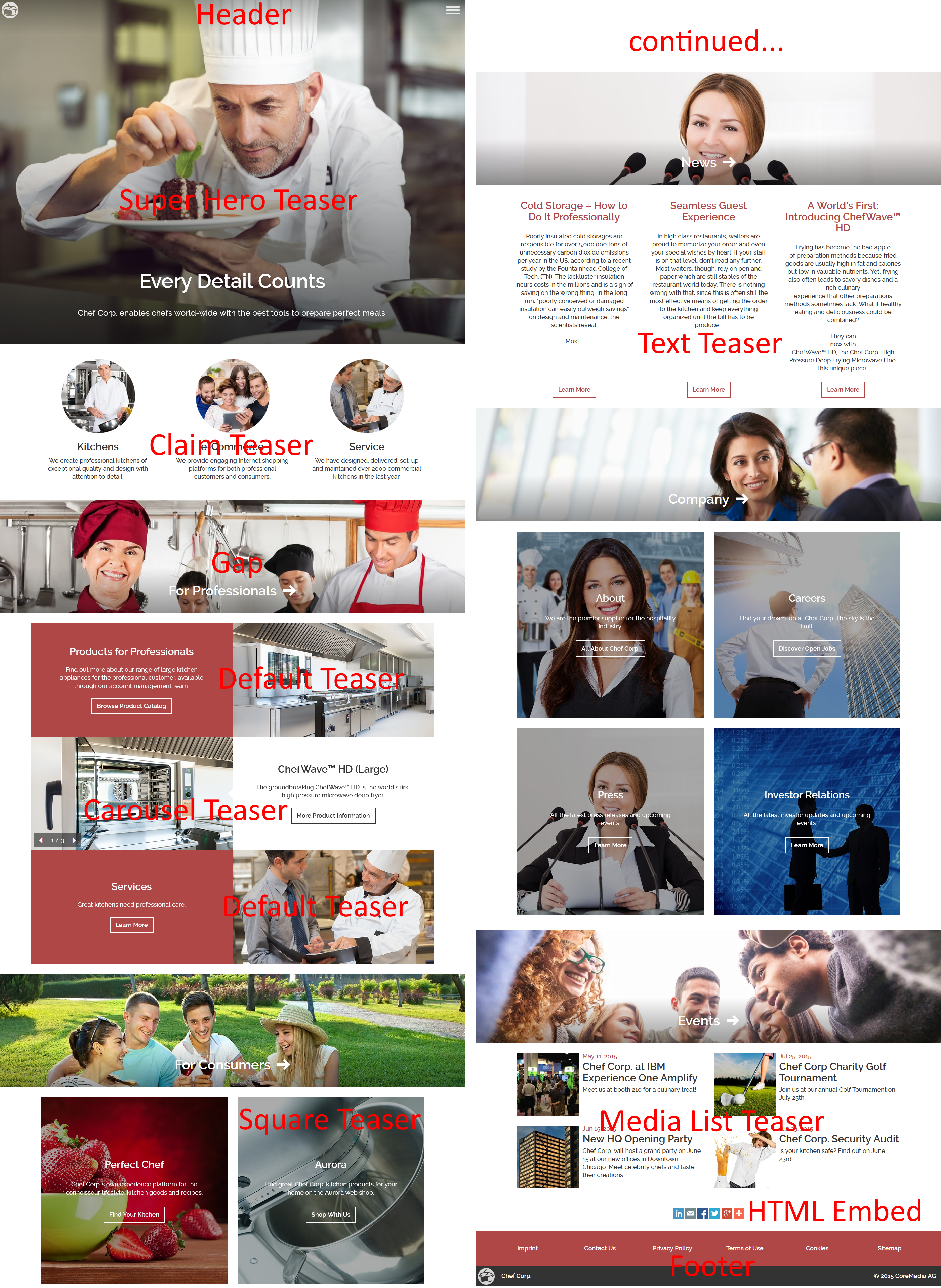
A long-scroller page with a "Super Hero" full screen teaser module at the top and visual "gap" headings that span the screen width. Several default placements demonstrate how layout settings can be done either directly on a placement or on a collection.
- Brand Hero Page
A secondary navigation page with a large, emotional header image that spans the content width and several placements.
- Corporate Detail Page
Corporate Detail Page: A simple, standard page with header, footer, main as well as above-main and below-main placements.
- Corporate Detail Page with Sidebar
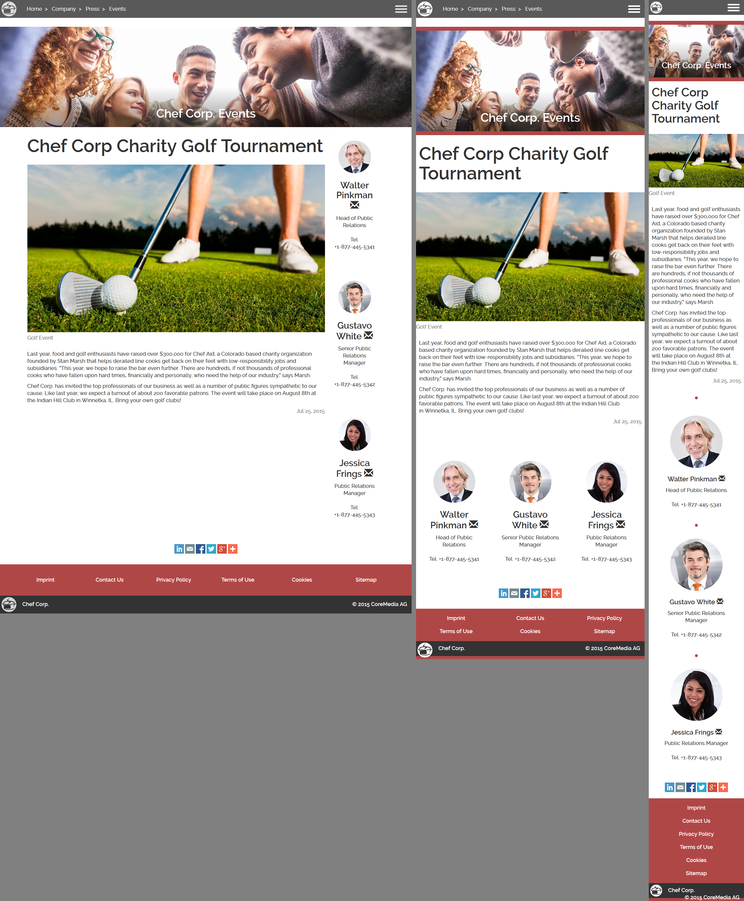
Corporate Detail Page with Sidebar: A variant of the Detail Page that displays a sidebar in a second column (desktop) or below the main placement (tablet, mobile). Useful for sections of a website with contact person teasers that can be inherited to detail article pages.
To simplify editorial use-cases for Brand casual users, a simplified page-centric editing model is supported via configuration:
All centralized assets are stored in the "Assets" folder.
Both navigation (Pages) and content are stored in the same repository folder structure that resembles the actual navigation structure of the site.
The "Create page from Template" feature enables users to quickly create pages of the above layout variants. The new page is added to the navigation parent and adds a new default article and an image is cloned that can be replaced by right-clicking in the preview and by directly uploading a new image and pasting text from Word.
Pages are now directly "teasable" and can be added as teasers to placements without the creation of a
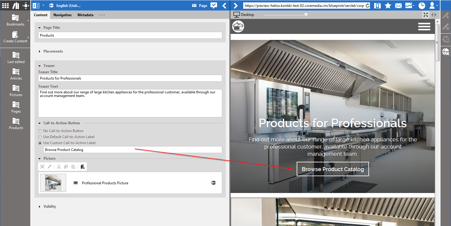
Teaserplaceholder document.Any teaser can have a freely editable "Call-to-Action" button.
Articles are also enhanced:
Richtext with embedded images
In-page carousel for multiple images with full-screen lightbox view
Related content teasers
They show a sidebar when defined in embedding page
Configurable "Externally Visible Date" that remains unmodified upon re-publication
Several teaser types for different use cases:
- Superhero
A large full-screen image, text and call-to-action button
- Hero
A content-width spanning image, with text and call-to-action button
- Default
Alternating left/right teaser module
- Carousel
Touch-enabled carousel of teasers
- Square
Square image teaser module
- Claim/Claim (Circle)
A row with of three thumbnails and teaser texts, with optional round image CSS effect
- Media List
Analogous to the Twitter Bootstrap style
- Text
A text only teaser, for example, for press releases
- Detail
Showing the actual content of an item, for example, to place a full article into a page
![[Note]](../common/images/note.png) | Note |
|---|---|
CMTeasable.ftl
is the teaser template that will always be used as a fallback for any document type that has no specific override.
|
Multi-Language/Multi-Site features:
Demo content in both English and German
Language chooser in front-end that allows directly switching between language variations of the same content item
All Studio translation, workflow and multi-site functionality is supported
SEO and conversion optimization:
Call-To-Action Buttons
Editable HTML Description Text
Editable HTML Title Suffix (for example, " | Chef Corp.")
Sitemap in both HTML and XML
Dynamic Content features:
News and news list based on search-based lists
Events and events list based on search-based lists
3rd Party Integrations:
Google Universal Analytics integration with optimization feedback loop
Optimizely Integration for A/B-Testing
Full support for embedding dynamic third-party HTML/Javascript modules with examples for the following web services:
SurveyMonkey, Google Calendar, Google Forms, Pinterest, Twitter
Template creation
Twitter Bootstrap is used as the layout foundation
All frontend code is based on Freemarker templates
CSS is built using the Sass and Grunt frameworks
A simple Print.css is supplied
Design and HTML were tested and optimized for Accessibilty
Studio configurations:
Configurable repository folder structure for Create dialogs
Certain form elements can be site-specifically enabled or disabled through settings
CAE extensions:
Shared template sets for teaser layout on both Placements and Collections via "Container" facade
Specific
Preview.cssfor Studio preview only


