This section describes general features of the Brand Blueprint website.
Long-scrolling pages
Brand Blueprint adds support for long-scrolling pages. Such pages usually have visual dividers to highlight different content sections - also called "Gaps" - that can have a parallax scrolling effect, that is, the picture inside the gap scrolls slower than the remainder of the page around it.
To configure gaps in the content, you have to add local settings.
Defining gaps for pages
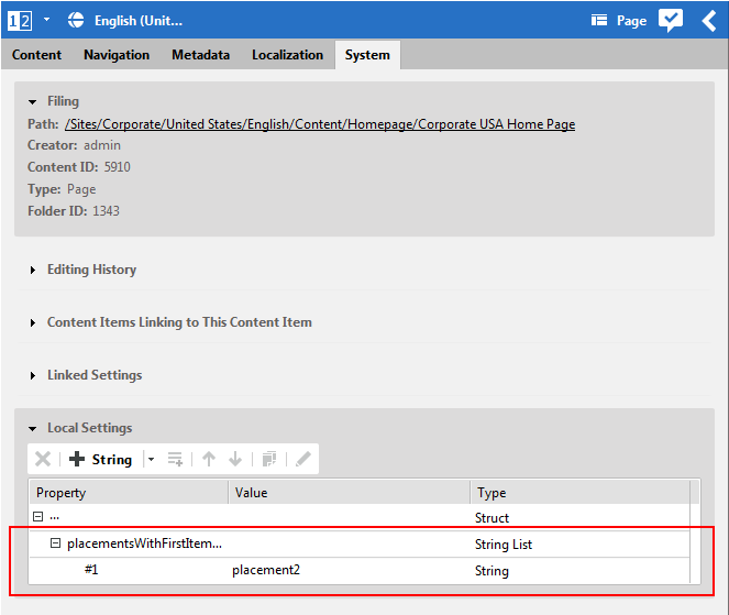
For pages, you define placements for which the first item is rendered as a gap. Add the placement name to a Struct String List placementsWithFirstItemAsHeader in Local Settings or a Linked Settings content.
For example, on the Brand Homepage, "placement2" containing the "For Professionals" section is configured and consequently, the first item "Professionals Page" is not rendered as a regular teaser, but as a gap.
Defining gaps for collections
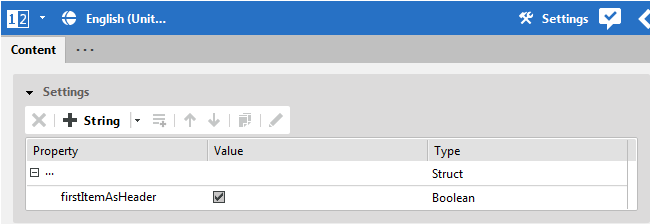
For collections, you can define if the first item of the collection should be rendered as a gap. In Local Settings or a Linked Settings content, set a Boolean property firstItemAsHeader to true.
For example, in Placement 3 of the homepage, the first item is "For Consumers Collection" (Square). This collection has a settings document linked that sets the "firstItemAsHeader" to true.
Teaser rendering behavior for Placements and Collections
Brand Blueprint allows to set a viewType on a placement of a page grid. This can be used to ease editorial tasks - any item added to a pre-configured placement automatically gets the desired rendering viewType applied.
Examples on the Homepage:
The "Hero" placement is set to "Superhero", which automatically renders any added content item as a full-size Superhero teaser.
The "Placement 1" is set to "Claim", which automatically renders any added content item as Claim teasers.
The "Placement 3" is set to "Default", so that contained Collections can set their own viewTypes specifically.
![[Note]](../common/images/note.png) | Note |
|---|---|
These are default settings. You are free to customize the page grid to your needs. |
Any setting on the placement in a page takes precedence over a setting on a collection that is inside the placement.
Example:
A placement with viewType="Square" contains a Collection with viewType="Claim"
"Square" wins, collection items are rendered as "Square".
A placement with viewType="Default" contains a Collection with viewType="Claim"
"Claim" wins, collection items are rendered as "Claim".
Additionally, through the Container facade, the same rendering templates also apply to Collections that are often used to define layout-specific rendering of teasers.
In the current Brand Blueprint release, it is not possible to set viewTypes directly on Teasers or other single content items. This can be achieved by creating additional viewType templates. Technically, the "Container" Facade only applies to lists of items, not to single items.
Collection view type lookup
In order to avoid duplication of layout templates for both Page Placements and Collections, a
joint View Type Lookup is implemented via interface
com.coremedia.blueprint.common.layout.Container. Just create a
CMViewtype in Options/Viewtypes/CMChannel/ for your Layout Variant,
and it will be available for both Placements and Collections.
Configurable HTML Title Suffix
A site-specific HTML Title Suffix can be set by a technical editor via a Struct Setting.
For example, all page titles get appended " | Chef Corp.", and pages inside the Press Release page structure get appended " | News | Chef Corp."
/Settings/Options/Bundles/Corporate_en
customTitleSuffixText(String)
Editable HTML description meta tag
Each content item can now have a specific text editorially configured for the HTML Description Meta Tag via Studio.
![[Note]](../common/images/note.png) | Note |
|---|---|
For articles that are embedded directly on a page in Detail view, the HTML Description of
the |
Configurable auto-shortening of teaser texts
As unedited teaser text is inherited directly from the detail body text, automatic shortening of too long teaser texts can be set for each teaser type with a site-specific Struct setting. The algorithm tries to shorten the text at word breaks.
Options/Settings/CAEConfig
teaser.max.length(Integer) - as in CM8text.max.length(Integer)claim.max.length(Integer)hero.max.length(Integer)superhero.max.length(Integer)square.max.length(Integer)
If the settings are not present, default values defined in templates will be used.
Configurable breadcrumb navigation
The breadcrumb display can be configured to omit first and last elements. For example, for a site you may want to suppress "Home" as a first breadcrumb element, or you might want to exclude "leaf content" (such as articles or other content items rendered in detail view) from the breadcrumb due to length and/or design constraints.
/Settings/Options/Bundles/Corporate_en
breadcrumbHideRootElement(boolean)breadcrumbHideLastElement(boolean)
![[Note]](../common/images/note.png) | Note |
|---|---|
If the last navigation element is a page itself, it will be rendered in the breadcrumb, even if
|
Configurable Call-To-Action text for teasers
For each teasable content item, an editor can set a specific "Call-To-Action" (CTA) text that is displayed as a clickable button. The default text for the CTA is pre-configured per document type in the language Bundle document (for example, Learn More for Articles). Users can override the default text or suppress the CTA button completely for each teaser.
The Studio forms for CMTeasable are extended for the Brand Blueprint to
handle the CTA text. The CTA configuration is stored in the "localSettings" struct property with
the following settings:
callToActionCustomText(String)callToActionDisabled(Boolean)


