Requirements
For a good user experience a website should not layout each and every page in a different fancy manner but limit itself to a few carefully designed styles. For example, most pages consist of two columns of ratio 75/25, where the left column shows the main content, and the right column provides some personalized recommendations.
In the best case an editor needs to care only for the content of a page, while the layout and collateral contents are added automatically, determined by the context of the content. However, there will always be some special pages, so the editors must be able to change the layout or the collateral contents. For example for a campaign page which features a new product they may omit the recommendations section and choose a simple one-column layout without any distracting features. In order to preserve an overall design consistency of the site, editors are not supposed to create completely new layouts. They can only choose from a predefined set.
Solution
CoreMedia Blueprint addresses these requirements with the concept of a page grid and placements.
The page grid does not handle overall common page features such as navigation elements, headers,
footers and the like. Those are implemented by Page templates with special views. Neither does
the page grid control the layout of collections on overview pages. This is implemented by
CMCollection templates with special views and view types.
You can think of a page grid as a table which defines the layout of a page with different sections. Each section has a link to a symbol document which will later be used to associate content with the section. Technically, the layout of a page is defined in form of rows, columns and the ratio between them. A page grid contains no content and can be reused by different pages. So you might define three global page grids from which an editor can select one, for instance.
The content for the page grid on the other hand, is defined in a CMChannel document in so called
placements, realized as link lists in structs. Each placement is associated with a specific position of the
page grid through a link to a symbol document. The editor can add content to the placement, collections for
example, which will be shown at the associated position of the page grid.
Placements can also be shared between channels because a child inherits the placements of its parent. A prerequisite for inheritance is that the page grids of the parent and child page must have sections with the same name. For example, the parent channel has a two-column layout with the sections "main" and "sidebar". The child channel has a three-column layout with the sections "main", "sidebar" and "leftcolumn". For the placements this means:
The child must fill a placement with content for the "leftcolumn" section, because the parent has no such section.
The child will override the placement for the "main" section with its content. Inheritance makes no sense for the "main" section.
The child does not need to declare a "sidebar" placement but can inherit the "sidebar" placement of the parent, even though it uses a different layout.
Before going into the implementation details of the page grid, you will see how to work with page grids in CoreMedia Studio.
Page grids in CoreMedia Studio
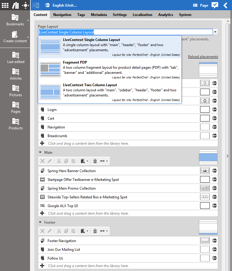
Editors can manage pages directly by editing the "placements" in the page grid in
CMChannel documents (localized as Page in CoreMedia Studio).
A placement is a specific area on a page such as the navigation bar, the main column or the right
column. A CMChannel can inherit page grid placements of its parent channel. For
example, the Sports/Football section of a site can inherit the right column from the Sports
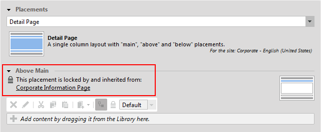
section. Editors can also choose to "lock" certain placements and thus prevent subchannels from
overwriting them. Each page grid editor provides a combo box to choose between different layouts
for a page. Depending on the selected layout, placement may inherit their content if the same
placement is defined in the layout of the parent page.
Each placement link list can configure a view type. The view type determines how the placement is rendered.
To define which placement view types are available for a page in some site, view type
(CMViewtype) documents are placed in view type folders under a site-relative path
or at global locations.
The default paths are the site-relative path Options/Viewtypes/ and
the absolute path /Settings/Options/Viewtypes/.
This can be configured via the application property pagegrid.viewtype.paths, which contains
a comma-separated list of repository paths. Each path may start with a slash ('/')
to denote an absolute path or with a folder name to denote a path relative to a site root folder.
When changing these values, please make sure that the existing view type documents are moved or copied
to the new target location.
Web pages are represented in the CAE using the
com.coremedia.blueprint.common.contentbeans.Page object which consists of two
elements: the content to be rendered and the context in which to render the content.
Pages where the content to be rendered is the same as the context (for example, section overview) display the page grid of the context. Pages where content items (such as Articles) are displayed within a context use display the context's page grid but replace the "main" placement with the content item.
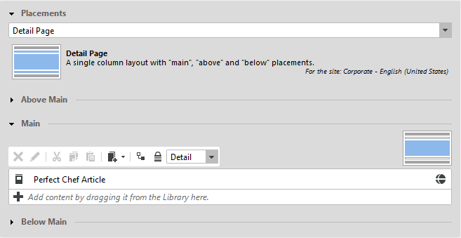
Each placement has an icon symbolizing where it is located on the page. It contains a link list and several additional buttons on top of it. The order of the linked elements can be modified using drag and drop.
Instead of adding own content, a placement can inherit the linked content from a parent's page placement. If you inherit the content, you cannot edit the placement in the child page. You have to deactivate the "override" button to change the content of the placement.
A placement can be locked using the "lock" button. In this case all child placements are not able to overwrite this placement with own content.
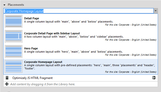
The page grid editor provides a combo box with predefined layouts to apply to the current page. After changing the layout, the Studio preview will immediately reflect the new page layout.
The layout of a parent page grid may be changed so that it does not fit anymore with the layout of a child page which inherits some settings. A child may use a three-column layout and inherit most of its content from its parent page that also uses a three-column layout. Then, the layout of the parent may be changed to another layout with a single column that doesn't contain any of the needed layout sections. The child configuration is invalid in this case and the user has to reconfigure all child pages.
Currently there is no kind of detection for these cases in Studio, so the user has to check manually if the child configurations are still valid.
How to configure a page grid editor
The Blueprint base module bpbase-pagegrid-studio-plugin
provides an implementation of the page grid editor shown above
through the config class
pageGridPropertyField in the package
com.coremedia.blueprint.base.pagegrid.config.
In many cases, you can simply use this component in a document form
by setting only the standard configuration attributes
bindTo, forceReadOnlyValueExpression,
and propertyName
If you want to adapt the columns shown in the link list editors for
the individual section, you can also provide fields and columns using the
attributes fields and columns, respectively.
The semantics of these attributes match those of the
linkListPropertyField component.
How to configure the layout location
Pages look up layouts from global and site specific folders.
By default, the site specific page grid layout path will point to Options/Settings/Pagegrid/Layouts
and the global one to /Settings/Options/Settings/Pagegrid/Layouts.
This can be changed via the application property pagegrid.layout.paths, which contains
a comma-separated list of repository paths. Each path may start with a slash ('/')
to denote an absolute path or with a folder name to denote a path relative to a site root folder.
When changing these values, please make sure that the existing page layout documents are moved or copied
to the new target location.
Also, mind that when looking for the default page layout (see below), paths mentioned first take precedence,
so it usually makes sense to start with site-relative paths and continue with absolute paths.
![[Caution]](../common/images/caution.png) | Caution |
|---|---|
The default layout settings document |
![[Caution]](../common/images/caution.png) | Caution |
|---|---|
If several layout folders are used, make sure that the layout settings documents have unique names. |
How to configure a new layout
Every CMSettings document in a layout folder is recognized
as a layout definition.
The settings struct property defines a table layout
with different sections.
The struct defines two integer properties with the overall row and
column count.
The struct data may also contain two string properties name
and description, which are used for
the localization of page grid layout documents
(see the section called “How to localize page grid objects”).
The items property contains a list of substructs,
each defining a section of the page grid.
The order in which the sections appear in the struct list matches the order
in which the link lists of the individual sections are shown by the page grid editor.
The sections are represented by CMSymbol documents. The layout definition
is inspired by the HTML table model,
even though CoreMedia Blueprint's default templates do not render page
grids as HTML tables but with CSS means.
The sections support the following attributes:
col: The column number where the section is placed or, if thecolspanattribute is set, the column number of the leftmost part of the section.row: The row number where the section is placed or, if therowspanattribute is set, the row number of the topmost part of the section.colspan: The number of columns spanned by the section.rowspan: The number of rows spanned by the section.width: The width of this section in percent of the total width.height: The height of this section in percent of the total height.
The col, row and rowspan attributes of the section must
match the grid layout defined by the colCount and colRow attributes
(see Example 6.1, “Pagegrid example definition”). That is, when colCount and colRow
are "3" and "4", for example, then you have 12 cells in the page grid table layout which must all be filled by the sections.
No cell can be left empty, and no section can overlap with other sections.
The height attribute is only used for the preview of the layout in the page form. It has no impact on the delivered website.
The default PagegridNavigation layout settings document with a 75%/25% two
column layout looks as follows:
<Struct xmlns="http://www.coremedia.com/2008/struct" xmlns:xlink="http://www.w3.org/1999/xlink">
  <IntProperty Name="colCount">2</IntProperty>
  <IntProperty Name="rowCount">1</IntProperty>
  <StructListProperty Name="items">
    <Struct>
      <LinkProperty Name="section" xlink:href="coremedia:///cap/content/550" LinkType="coremedia:///cap/contenttype/CMSymbol"/>
      <IntProperty Name="row">1</IntProperty>
      <IntProperty Name="col">1</IntProperty>
      <IntProperty Name="height">100</IntProperty>
      <IntProperty Name="width">75</IntProperty>
      <IntProperty Name="colspan">1</IntProperty>
    </Struct>
    <Struct>
      <LinkProperty Name="section" xlink:href="coremedia:///cap/content/544" LinkType="coremedia:///cap/contenttype/CMSymbol"/>
      <IntProperty Name="row">1</IntProperty>
      <IntProperty Name="col">2</IntProperty>
      <IntProperty Name="height">100</IntProperty>
      <IntProperty Name="width">25</IntProperty>
      <IntProperty Name="colspan">1</IntProperty>
    </Struct>
  </StructListProperty>
  <StringProperty Name="name">2-Column Layout (75%, 25%)</StringProperty>
  <StringProperty Name="description">Two column layout with main and sidebar sections</StringProperty>
</Struct>
Example 6.1. Pagegrid example definition
![[Caution]](../common/images/caution.png) | Caution |
|---|---|
The main content of a document will always be rendered into the |
How to configure a read-only placement
The page grid layout definition provides the possibility to declare a read-only section. The
Boolean property "editable" has to be declared for the struct element of
the corresponding section, for example:
<Struct>
  <LinkProperty Name="section" xlink:href="coremedia:///cap/content/120" LinkType="coremedia:///cap/contenttype/CMSymbol"/>
  <IntProperty Name="row">2</IntProperty>
  <IntProperty Name="col">1</IntProperty>
  <IntProperty Name="colspan">1</IntProperty>
  <IntProperty Name="height">75</IntProperty>
  <IntProperty Name="width">25</IntProperty>
  <BooleanProperty Name="editable">false</BooleanProperty>
</Struct>
The section that matches the given symbol will be shown as disabled in Studio. The matching placements will not appear in the editor.
How to populate a page grid with content
Page grids are defined in the struct property CMNavigation.placement of a
channel.
Such structs are typically created using the page grid editor shown above.
Example:
<Struct xmlns="http://www.coremedia.com/2008/struct" xmlns:xlink="http://www.w3.org/1999/xlink">
  <StructListProperty Name="placements">
    <Struct>
      <LinkProperty Name="section" LinkType="coremedia:///cap/contenttype/CMSymbol" xlink:href="coremedia:///cap/content/550"/>
      <LinkProperty Name="viewtype" LinkType="coremedia:///cap/contenttype/CMViewtype" xlink:href="coremedia:///cap/content/1784"/>
      <LinkListProperty Name="items" LinkType="coremedia:///cap/contenttype/CMArticle">
        <Link xlink:href="coremedia:///cap/content/134"/>
        <Link xlink:href="coremedia:///cap/content/498"/>
      </LinkListProperty>
    </Struct>
    <Struct>
      <LinkProperty Name="section" LinkType="coremedia:///cap/contenttype/CMSymbol" xlink:href="coremedia:///cap/content/544"/>
      <LinkListProperty Name="items" LinkType="coremedia:///cap/contenttype/CMArticle">
        <Link xlink:href="coremedia:///cap/content/776"/>
      </LinkListProperty>
    </Struct>
  </StructListProperty>
  <StructProperty Name="placements_2">
    <Struct>
      <LinkProperty Name="layout" LinkType="coremedia:///cap/contenttype/CMLayout" xlink:href="coremedia:///cap/content/3488"/>
    </Struct>
  </StructProperty>
</Struct>
A placement struct contains a list of section structs placements.
The placements_2 struct contains another struct,
placements and a link property layout, which
determines the layout for this channel.
The placements struct property consists of substructs for the single
placements, each of which refers to a section and lists its contents in the items property.
Additionally, each placement can declare a view type.
Layouts and placements are connected by the section documents. Let's assume you have two sections, "main" and "sidebar". Your channel declares some latest news for the main section and some personalized recommendations for the sidebar. The layout definition consists of one row with two columns, the left column refers to the "main" section, the right column refers to the "sidebar". This will make your channel be rendered with the main content left and the recommendations on the right. If you don't like it, you can simply choose another layout, for example with a different width ratio of the columns or with the sidebar left to the main section.
The rendering of a page grid is layout-driven, because the sections of the table-like layout model must be passed to the template in an order which is suitable for the output format (usually HTML). CoreMedia Blueprint's web application processes a page grid as follows:
The
PageGridServiceImpldetermines the layout document of the channel. If there is no layout link in theplacements_2struct, a fallback documentPagegridNavigationis used. This name can be configured by setting the application propertypagegrid.layout.defaultName. The fallback layout document can be located in any of the configured layout folders (see "layout locations"), usually it will be located under the site relative pathOptions/Settings/Pagegrid/Layouts. The layout definition is evaluated and modeled by aContentBackedStyleGrid.The
PageGridServiceImplcollects the placements of the channel itself and the parent channel hierarchy. The precedence is obvious, for example a channel's own placement for a section ("sidebar" for instance) overrides an ancestor's placement for that section.Both layout and placements are composed in a
ContentBackedPageGridwhich is the backing data for aPageGridImpl.PageGridImplimplements thePageGridinterface and prepares the data of theContentBackedPageGridfor access by the templates. Basicallyit wraps the content of the placements into content beans,
it arranges the placements in rows and columns, according to the layout
it replaces the channel's main placement with the requested content.
Blueprint's default templates (namely
PageGrid.jsp) do not render page grids as HTML tables but as nested <div>
elements and suitable CSS styles. The beginning of a rendered page grid looks like this:
  <div id="row1" class="row">
      <div id="main" class="col1 column col1of2 width67">
The outer <div> elements represent the rows of the page grid, the inner <div> elements represent the columns. The ids of the rows are generated by the template as an enumeration. The ids of the columns are the section names of the placements. The column <div> elements are rendered with several class attributes:
column: A general attribute for column <div> elementscol1: The absolute index of the column in its rowcol1of2: Thecolspanof this column (1) and the absolute number of columns of the page grid (2)width67: The relative width of this column
You can use these attributes to define appropriate styles for the columns.
CoreMedia Blueprint's default CSS provides styles which reflect the
width ratios of some typical multi-column layouts. You find them in the document
/Themes/basic/css/basic.css in the content repository where you can enhance
or adapt them to your needs.
In the inner <div> elements the placements are included, and their section names determine
the views. For example a "sidebar" placement is included by the
PageGridPlacement.sidebar.jsp template.
How to localize page grid objects
To localize a layout name, create a
resource bundle entry with the key <layoutname>_text
in the resource bundle PageGridLayouts_properties,
where <layoutname> is the name of the layout document
or, preferably, the name property of the settings struct
of the layout.
Similarly, a layout description can be localized with entries of the form
<layoutname>_description. If no corresponding resource
bundle entries are found, the description property
of the settings struct of the layout is used.
If that property is empty, too, the name is used as the description.
The resource bundle is available
in the package com.coremedia.blueprint.base.pagegrid
of module bpbase-pagegrid-studio-plugin.
For the purposes of localization, placements are treated as pseudo-properties
and localized according to the standard rules for content properties
as described in the [Studio Developer Manual].
The name of the pseudo-property is <structname>-<placementname>,
where <structname> is the name
of the struct property storing the page grid
and <placementname> is the name of the section document.
For example, a placement with the name main that is referred
from the standard page grid struct placement
of a CMChannel document would obtain its localization
using the key CMChannel_placement-main_text.
You can add localization entries to the resource bundle BlueprintDocumentTypes_properties
of module blueprint-forms,
which is applied to the built-in resource bundle ContentTypes_properties
at runtime.
To localize a view type name or a view description, you can
add a property <viewtypename>_text or
<viewtypename>_description to the bundle
Viewtypes_properties.
Here <viewtypename> is the name of the view type document
or, preferably, the string stored in its layout property.
Because view types are also used in other contexts,
this bundle has been placed in the package
com.coremedia.blueprint.base.components.viewtypes
of module bpbase-studio-components.
CoreMedia Blueprint defines
three resource bundles
BlueprintPageGridLayouts_properties,
BlueprintPlacements_properties, and
BlueprintViewtypes_properties.
Entries of these bundles are copied
to the bundles described above, providing a convenient way to add
custom entries.


