


Studio User Manual / Version 2107
Table Of ContentsThe Workspace is your main working screen. As the Workspace supports drag and drop and context menus, you can work in the same way as with a normal desktop application. One special feature is the combination of the Form View (5) on the left side and the Preview (6) on the right side. Changes that you make in the Form View are immediately visible in the Preview, whereas right clicking on an element in the Preview highlights the associated field in the Form View.
The Library (8) and the Control Room (1) can both be displayed docked (default for the Control Room) and a floating mode (default for the Library). Docking is available on the left side next to the Favorites Toolbar and on the right side next to the Actions Toolbar and is indicated when the dividing line changes its color to blue. The position of the components can be changed via drag and drop. When Library and Control Room are both docked in the same area, they hide each other on activation. The size and position of the Library and the Control Room are persisted and get restored on Studio startup.
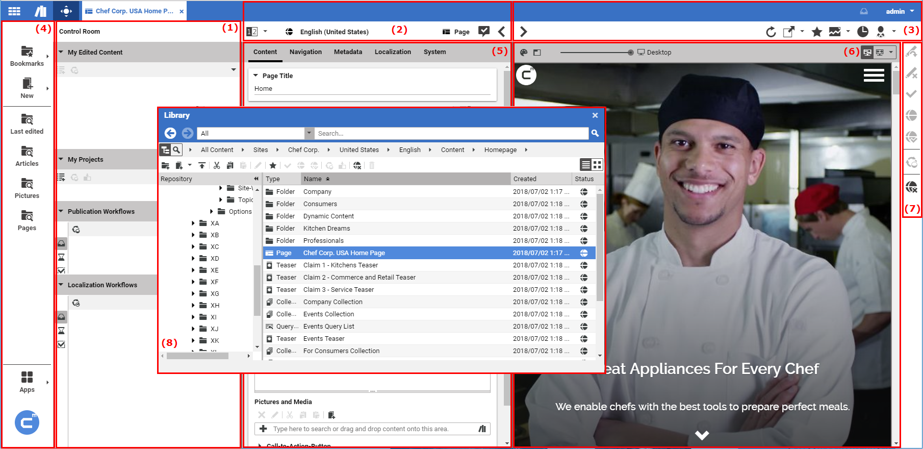
The Workspace consists of a number of different functional components:
(1) Control Room
(2) Form Toolbar
(3) Preview Toolbar
(4) Favorites Bar
(5) Form View
(6) Preview
(7) Action Bar
(8) Library
Above the Preview Toolbar in the upper right corner you will find the user menu which allows you to log out and to adapt user specific settings for CoreMedia Studio.
The following icons are used in the Overview Window:
| Icon | Name |
|---|---|
| Dashboard |
| Library |
| Control Room |
| Search folders |
| Create Content |
| Apps |
Table 2.1. Key icons in the Overview Window
Control Room
You manage your current projects and workflows in the Control Room (see Section 2.4.2, “Control Room”). You find all content items you have currently edited, you can create and manage projects and use them to start workflows.
Form Toolbar
The Form Toolbar presents you with information about the current state of the content item. In addition, you can also use the arrow icons "<" and ">" to hide or show (collapse/expand) the Preview.
Preview Toolbar
Use the Preview Toolbar to show or hide (expand/collapse) the Preview, to navigate between different pages or to send the address of the content item you are currently editing to a colleague.
Favorites Bar
You can use the Favorites Bar to open the Library  , the Dashboard and the Control Room . In addition, you can use predefined searches
(see Section 4.3.3, “Using Search Folders”)
and in Blueprint the create content
menu. At the bottom of the favorites bar you find the Apps menu.
, the Dashboard and the Control Room . In addition, you can use predefined searches
(see Section 4.3.3, “Using Search Folders”)
and in Blueprint the create content
menu. At the bottom of the favorites bar you find the Apps menu.
Form View
Use the Form View to edit your content items. As soon as you start editing, you are given exclusive editing rights, that is, other users will no longer be able to change any content. The Properties tab lists certain items of content metadata. Path is used to show the content item in the Library. You can use the field Editing History to open previous versions of the content item. If you have several Forms open, you can sort them dragging the tabs. Right clicking on the tab opens a context menu where you can, for example, close all other forms.
Preview
In the Preview, you can see the content item being edited in the Form View as it would appear on your website. The field currently being edited is in the focus of the Preview. Similarly, if you right-click on an area in the Preview, then the associated field in the Form View is also highlighted. When hovering with the mouse over the Preview, the selectable areas are highlighted by a gray border (To disable the highlights on mouse over see Section 3.3.8, “Disabling the Highlighting of Preview Content on Mouseover”). If the Preview contains links, then you can also use these to navigate and open up an augmented page, for example. You can then use the browser's context menu or the reload icon in the URL of the preview to return to your original page.
You can zoom into the preview or adapt the preview to the window size using the icons at the top of the preview.
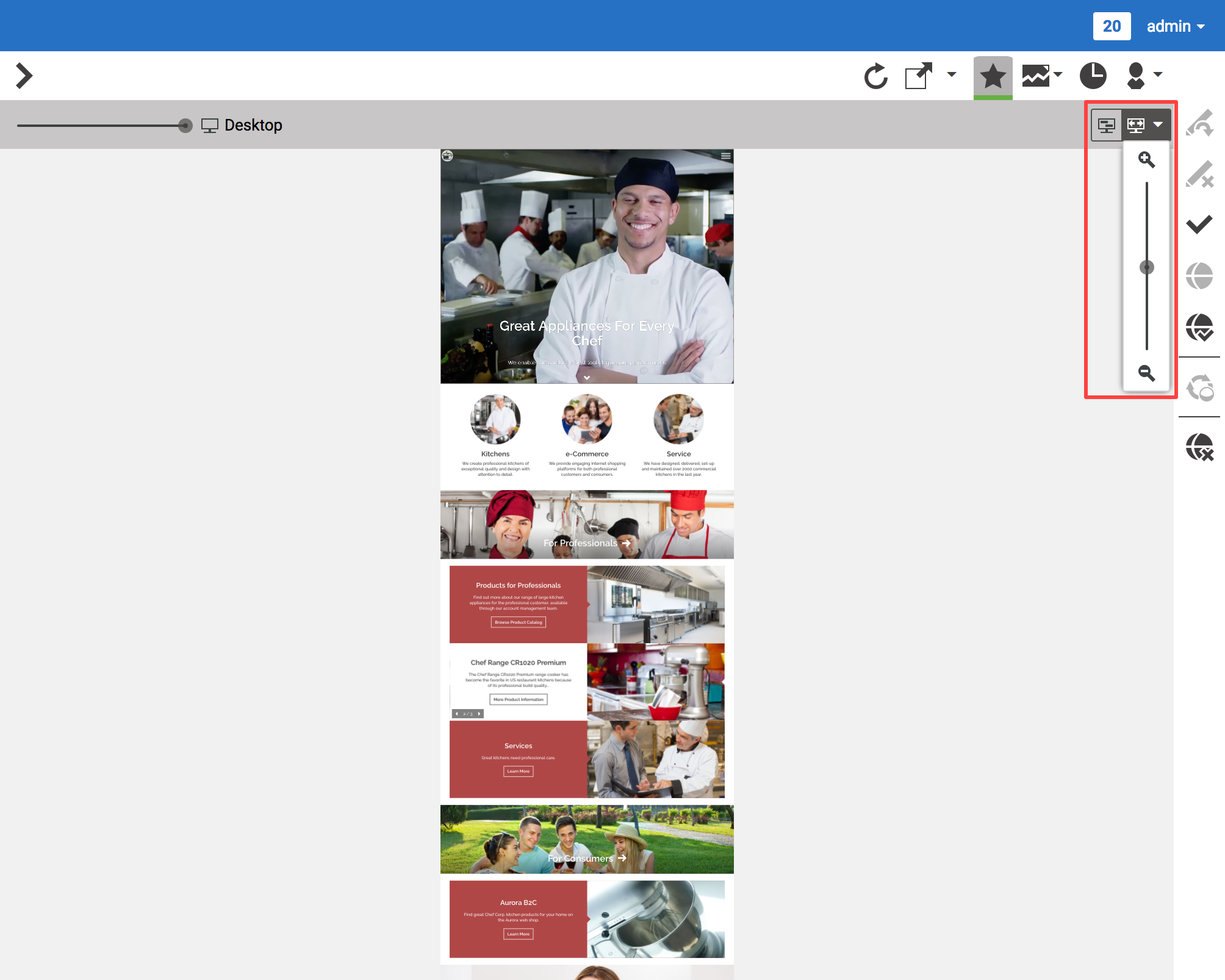
With the slider at the top left you adapt the Preview to different output devices.
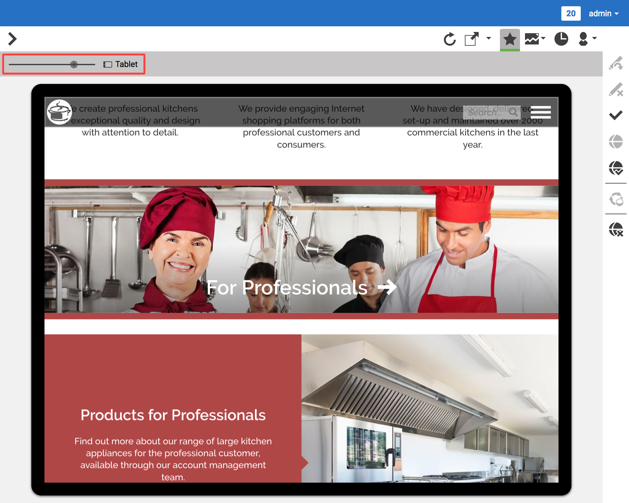
The layout of a page can change in your CoreMedia system depending on the output device ("responsive Design"). For a mobile phone, for example, a single-column layout is better to use, due to the screen size. The devices are depicted in the preview as is shown in Figure 2.15, “Adapt the Preview for different devices”.
With the button at the top left you can highlight placements in the preview. The button is only visible when the page contains placements.
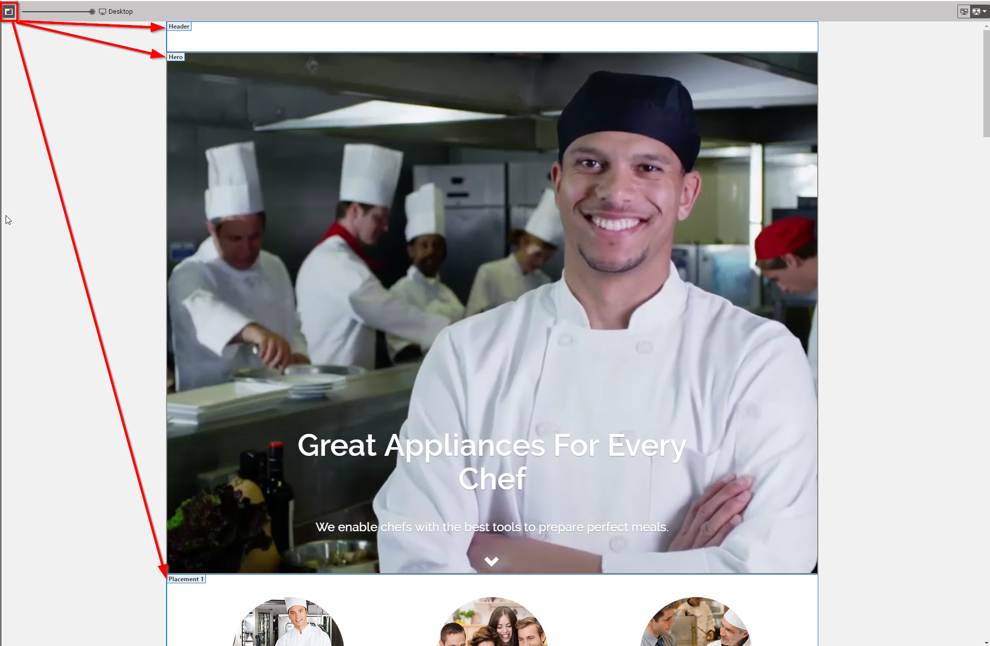
By clicking the button, the placements on the page are highlighted in a blue box with the Placement Name in the left upper corner. Figure 2.16, “Highlight Placements in the preview”.
